Potential Improvements to the Home Page 3
Recommendations to Improve the ‘Check Inclusion in the Register’ Service 4
Recommendations to Improve the ‘Applications, Requests’ Service 6
Recommendations for Potential Changes to the Electoral Address Change Application Form 7
Recommendations and Potential Improvements to the ‘Help’ Section 8
DESCRIPTION OF THE SURVEY FINDINGS 9
VOTING EXPERIENCE AND INTERACTION WITH THE ‘STATE VOTER REGISTER’ 10
Experience of Participating in Elections 10
Previous Experience Using the ‘Voter’s Personal Account’ 11
Home Page and Navigation of the ‘Voter’s Personal Account’ Service 12
User Account Navigation. Navigation Buttons. 16
Analysis of How Users Perceive and Understand Each Section of the Home Page 16
Version for People With Visual Impairments 24
‘Inclusion Verification’ Service 25
Verifying Inclusion in the State Voter Register in Figures (Homework Completion) 25
User Journey When Verifying Inclusion in the State Voter Register. 27
Respondents’ Assessment and Impressions of the Form of Verifying Inclusion in the Register 28
Assessment of Verification Code Delivery Channels and Formats 29
Perception and Understanding of the Term ‘Electoral Address’ in the Request Form 30
Interpretation and Clarity of the Result of Verifying Inclusion in the Register 31
Recorded Cases of Negative Search Results and Possible Reasons 32
Alternative Data for Verifying Inclusion in the Register 35
‘Applications, Requests’ Service 37
Respondents’ Assessment and Impressions of the ‘Applications, Requests’ Service 37
User Experience of Submitting a Request to Change One’s Electoral Address 45
Submission of a Request to Change Electoral Address 45
User Journey for Changing an Electoral Address 47
Analysis of Perceptions and User Experiences with the Electoral Address Change
Application Form 48
Clarity of Requirements for Documents to Confirm an Electoral Address 50
Experience Interacting With the State Voter Register Website 52
INTRODUCTION
Voters should have simple and accessible ways to verify their data and, if necessary, request corrections or amendments. With the development of digital tools, it is important that such procedures remain clear and user-friendly, and do not create additional barriers to the exercise of electoral rights. Simple procedures, intuitive navigation and the ability to quickly perform a required action are key factors in citizens’ willingness to use government online services and update their personal data. This takes on particular significance given the large-scale internal and external displacement of Ukraine’s population, as the participation of citizens themselves in verifying and updating their data in the State Voter Register is a crucial element to ensure the register’s relevance.
To assess the extent to which the SVR online services meet these expectations, the Civil Network OPORA conducted a study on the user experience of interacting with the ‘Voter’s Personal Account’. The focus was on three key elements of the service: home page, ‘Inclusion Verification’ and ‘Applications, Requests’ sections. The study aimed to determine how understandable the service’s logic and navigation are to users, whether they are able to independently verify their inclusion in the Register and correctly interpret the result, and what difficulties they encounter during the procedure for changing their electoral address.
The research scenario and toolkit were developed by OPORA, while the fieldwork phase was conducted by the research agency Info Sapiens between 28 August and 15 September 2026. Five focus group discussions were held: with participants aged 18–24, 25–59 and over 60; separately with citizens aged 25–59 who do not reside at their place of registration (including IDPs), and citizens of the same age group residing abroad. A detailed description of the study design and methodology is provided at the end of the report.
KEY FINDINGS
The study results indicate the functionality of the ‘Voter’s Personal Account’. The main features tested are understandable to a significant portion of the participants. Concurrently, the Personal Account structure largely reflects the logic of election procedures, which may not always align with the logic of a user coming with a specific need. Hence, the main difficulties arise not from a lack of necessary features, but from how easily a user can find the appropriate action, understand its purpose and complete the required procedure.
The ‘Voter’s Personal Account’ generally fulfils its primary purpose; however, using it is not sufficiently intuitive at every stage – especially for a first-time website visitor. Most study participants had not used this online service before, so they essentially familiarised themselves with its logic immediately during the testing. Meanwhile, the simpler scenario, namely verifying inclusion in the State Voter Register, was fully completed by 92% of the participants, and 86% rated it as easy. In contrast, the task of changing the electoral address was fully completed by 69% of participants, with some difficulties arising even before filling out the application itself – specifically while searching for the required feature or undergoing electronic identification. At the same time, the participants had a clearly defined task and were motivated to complete it. This underscores the importance of the service being intuitive from the very first interaction, as a user unfamiliar with the Personal Account structure needs to immediately grasp what actions are available, where to find the required service, and what steps the procedure involves.
Major difficulties relate not so much to the functionality of the Voter’s Personal Account or its visual design as to the way user interaction is organised. Participants had differing opinions on the design: some considered it outdated, while others appreciated the restrained and formal appearance of the government website. Across various groups, difficulties in relating the website structure and the official names of services to the specific action required were observed much more consistently. For older users, readability and certain labels – such as ‘Inclusion Verification’ – posed additional barriers, while other groups encountered difficulties when trying to find a specific function among the various sections. This was particularly evident in the ‘Applications, Requests’ section, as the official names of certain submissions did not always make it immediately clear what specific action or life situation they covered.
It is important for users to receive the necessary explanations directly at the stage where questions or difficulties may arise. Indeed, during the inclusion verification, the need for additional explanations arose primarily when the outcome did not meet the user’s expectations: before submitting the application – when they needed to understand its purpose and requirements; and while working with the documents – when questions arose about specific requirements. A similar issue also arose when using the ‘Help’ section: some participants did not notice it at all, while others, upon opening the home page, perceived it primarily as a source of legal information. At the same time, users did not always realise that the content of the ‘Help’ section varies depending on the page and may contain tips specific to the current procedure. Thus, the mere availability of reference information does not guarantee that a user will find it, correctly understand its purpose and use it at the right moment.
The greatest uncertainty arises not during the standard execution of a procedure, but rather when the outcome differs from what was expected or a problem occurs. In the normal course of events, the verification of inclusion in the Register was clear to the vast majority of participants: 96% of those who performed the task described the outcome as understandable. However, additional questions arose when a voter could not be found in the Register, the displayed electoral address did not match their expectations, or the user failed to distinguish between the electoral address, the registered or declared place of residence, and the actual place of residence. In such situations, the outcome alone was not enough for the participants: they were trying to figure out how to interpret it and what options were available next – for example, what an ‘electoral address’ means, whether they needed to change it given their situation, and where that could be done. Similar uncertainty arose when technical errors occurred during electronic identification, as the error message itself did not always give users a sufficient understanding of the cause or the steps to take next.
Different user groups share the need to quickly find the relevant action and understand the sequence of steps required to complete it, although the specific barriers vary. Younger participants navigated the digital environment more easily and placed greater emphasis on the interaction speed and the smartphone usability. For participants aged 60+, readability, the clarity of labels and difficulties encountered during electronic identification were more important concerns. For citizens not residing at their registered address, finding the relevant section was a notable challenge, particularly when changing their electoral address. For citizens living abroad, specific issues included which documents could be used to prove residency and how to enter a foreign address in both Ukrainian and Latin characters.
Voters typically interact with the ‘Personal Account’ only occasionally. The need to verify data in the SVR, update one’s electoral address, or submit a relevant request typically arises not on a regular basis, but during specific periods, primarily in connection with an electoral process or changes in personal circumstances. Thus, the user does not necessarily possess prior knowledge of the service’s structure or terminology; each new interaction may require them to re-orient themselves within the available services and the sequence of steps. This further highlights the importance of ensuring the service is intuitive for users with no prior experience.
RECOMMENDATIONS
Potential Improvements to the Home Page
Clarity of ‘Voter’s Personal Account’ functionality
Reason / Issues Identified:
- When first encountering the service, users do not always immediately understand what practical actions they can perform in the ‘Voter’s Personal Account’. Some services have sufficiently clear names, but many of the available functions are hidden behind generic section titles, such as ‘Applications, Requests’.
- To find the necessary action, some users had to familiarise themselves further with the website structure, navigate between sections, or consult the User Guide.
Potential Areas for Improvement:
- On the home page, present the key features of the ‘Voter’s Personal Account’ clearly and concisely through specific user actions, rather than just by listing the names of internal sections.
General appearance and navigation of the home page
Reason / Issues Identified:
- Some participants perceived the design as outdated or overloaded with certain elements.
- Issues with navigation in the mobile version and the visibility of certain elements.
Potential Areas for Improvement:
- Modernise the home page structure: transition from text-based links to a more intuitive block/card-based layout, with a focus on core services.
- Review the visual design of individual elements, particularly contrast and the use of colour to distinguish blocks, to improve readability and visual hierarchy.
- Evaluate the advisability of displaying a sidebar menu and a central block containing the same links simultaneously.
- Ensure that key navigation elements are clearly visible in the mobile version; use text labels or clear tooltips for icons whose meaning may not be immediately obvious.
- Improve the visibility of elements: increase the size of the font and controls at the top of the page, and make them more prominent.
Navigation, section names
Reason / Issues Identified:
- Section titles are not always clear.
Potential Areas for Improvement:
- Clarify the names of the main sections: replace ‘Inclusion Verification’ with ‘Check Inclusion in the Voter Register’ or another phrasing that immediately explains the purpose of the service.
- Make the steps involved in changing an electoral address clearer – for example, by providing a direct link from the home page or another intuitive way to access the relevant application.
- Add brief explanations to specialised sections – in particular, clarify what the ‘Open Data’ section contains and what data users can view there.
Recommendations to Improve the ‘Check Inclusion in the Register’ Service
Following a strategic workshop held by OPORA and the Central Election Commission, the Commission began implementing specific changes to the State Voter Register services. Some of them align with the directions of the recommendations formulated based on the findings of the focus group study. For the relevant recommendations, the current status of their implementation is indicated separately.
Method of Identification and Form Completion
Reason / Issues Identified:
- Dependence of the verification process on the manual entry of personal data.
- Manual entry of personal data creates an additional risk of error, which may affect search results.
- For some users, entering large amounts of data is inconvenient, especially when using a smartphone.
Potential Areas for Improvement:
- Ensure the information regarding the voter’s inclusion in the Register and their polling station is displayed automatically following electronic identification via an electronic signature or Diia.Signature.
Status: is being implemented by the CEC. It is assumed that after electronic identification, the users will immediately receive information about their inclusion in the State Voter Register and the polling station.
- Integrate authorised verification directly into the ‘Inclusion Verification’ service. If, technically, this functionality remains in the ‘Applications, Requests’ section, the verification service should include a prominent link explaining this option.
- Do not use the electoral address as a mandatory identifier in cases where the voter can be identified using other personal data.
Status: is being implemented by the CEC. The electoral address is no longer a mandatory criterion for search results. It is retained, among other purposes, to help distinguish between voters when other personal data match.
- Consider using the RNOKPP (Registration Number of the Taxpayer’s Account Card) as an additional means of identification or for refining search results, without making it mandatory or replacing other available verification methods.
Locality Search and Selection
Reason / Issues Identified:
- Inconvenient search for a locality in the drop-down list.
- The button to expand the list is not sufficiently visible, making it difficult to find the desired locality.
Potential Areas for Improvement:
- Make the search element more prominent: prompt users that they can enter the name manually and use the list to select the appropriate option.
- Improve the visual design of the drop-down list: make the button for expanding it more noticeable.
Receiving and Entering the Verification Code
Reason / Issues Identified:
- Receiving the code exclusively by email presents a barrier for some users, particularly older adults.
- The length of the code and the need to manually copy it from an email cause inconvenience for some users, while delays in receiving it complicate the verification process.
Potential Areas for Improvement:
- Retain email as one of the available channels, but provide SMS as an alternative and additionally consider the use of messaging apps, provided this meets technical and security requirements.
- Simplify confirmation: consider shortening the code; for email verification, provide a direct confirmation link as an alternative to manually entering the code; for SMS verification, enable automatic code insertion.
- If the code is not received, provide a brief prompt outlining the available next steps and reduce the interval before it can be resent.
Verification Results and Next Steps
Reason / Issues Identified:
- Users do not always distinguish between an electoral address, a registered or declared place of residence, and an actual place of residence. Hence, a valid verification result may be perceived as unexpected or outdated.
- The explanations provided when verification fails do not always direct users to the appropriate next step.
Potential Areas for Improvement:
- In the event of an unsuccessful verification, provide guidance on next steps directly on the results page: verify inclusion again after electronic identification using an electronic signature or Diia.Signature and, if absence from the Register is confirmed, proceed to submit an application for inclusion in the State Voter Register.
- After a successful verification, provide a brief explanation of the electoral address and the available options for changing the voting location. Provide direct links to the relevant services.
- Adapt the content of the contextual ‘Help’ section based on the verification results, incorporating more detailed explanations and step-by-step guidance for situations requiring further clarification. This guidance should complement, rather than duplicate, the key next steps suggested directly on the results page.
Recommendations to Improve the ‘Applications, Requests’ Service
Access to Service Information Before Sign-In
Reason / Issues Identified:
- Before completing electronic identification, users cannot access some functionality and are therefore unable to review the application form, the requirements for filling it out, or the required documents in advance. Because of this, users may find it difficult to determine whether they have selected the right service and what to expect in the subsequent steps.
Potential Areas for Improvement:
- Allow users to review the purpose of the service, the list of required data and documents as well as the main steps of the procedure before signing in.
- Require electronic identification only when users directly proceed to filling out and submitting the application.
Application Titles and Plain Language
Reason / Issues Identified:
- The main issue lies not so much in the number of available applications as in their titles: legal terminology does not always make it easy for users to quickly identify the life situation or need addressed by a particular service. Some titles, such as ‘Request Regarding Errors in Another Person’s Register Entry’ or ‘Inquiry Regarding Voters Registered at One’s Own Electoral Address’, are open to different interpretations and require further explanation.
Potential Areas for Improvement:
- Retain the official titles of applications and inquiries while adding a brief explanation for each service that clarifies the specific action or life situation it is intended for.
- Where possible, include typical examples of situations in the brief explanation to help users relate the service to their own needs.
- Present legal grounds and regulatory explanations separately from the brief user description.
Recommendations for Potential Changes to the Electoral Address Change Application Form
Explanations for Individual Form Fields
Reason / Issues Identified:
- Some participants did not fully understand the purpose of ‘Other Details Defining the Address’ field or exactly what data should be entered into it.
Potential Areas for Improvement:
- Add a brief hint or example to the ‘Other Details Defining the Address’ field explaining when it should be completed and what information can be provided.
Requirements for Supporting Documents
Reason / Issues Identified:
- Information about which documents can or cannot be used to substantiate the relevant circumstances is not always easy to understand. During testing, some participants did not immediately notice the negation ‘not’ and interpreted documents listed as unacceptable as documents that could be used to verify their address.
- The acceptable file formats and maximum file size are specified in the document upload window; however, some participants sought further clarification of these requirements.
Potential Areas for Improvement:
- Visually distinguish between documents that can be used to substantiate the relevant circumstances and those that cannot.
- Present document lists as separate bulleted lists and use additional visual emphasis for key caveats, particularly phrases such as ‘is not’.
- Place the key requirements for supporting documents directly above the upload section so that users can see them when performing the relevant action.
- Repeat the brief information on accepted file formats and the maximum file size next to the ‘Add Document’ button, rather than displaying it only in the upload window.
Address Entry and Supporting Documents for Citizens Living Abroad
Reason / Issues Identified:
- During testing, participants living abroad did not always clearly understand which documents could be used to verify their actual place of residence. Participants suggested various options (including a passport, proof of local registration, a rental agreement, a bank statement) and required further clarification.
- Examples of acceptable documents are displayed in the form only when users add a document and select its type. Thus, before proceeding to the upload stage, users may not have a clear enough understanding of which specific document they need to prepare.
- Some questions arose regarding how to enter a foreign address in Ukrainian and in the Latin alphabet: it was not always clear to the participants what was meant by ‘postal address’ or how to correctly render the street name and other address elements in Ukrainian.
Potential Areas for Improvement:
- After users select ‘I live outside Ukraine’ condition, provide them with a brief explanation of the types of documents that can be used to verify their actual place of residence abroad, along with several typical examples, before they reach the document upload stage.
- Retain the detailed explanations and list of examples in the document upload section, but make the key information available earlier in the user journey.
- Add a brief explanation of how to enter a foreign address in Ukrainian and in the Latin alphabet, including what information should be provided in the ‘Postal Address’ field.
- Add an example of how to enter a foreign address.
Recommendations and Potential Improvements to the ‘Help’ Section
Content and Purpose of the ‘Help’ Section
Reason / Issues Identified:
- Respondents expect the ‘Help’ section to provide practical answers and explanations on how to complete specific actions. However, the section’s landing page contains primarily legal information that does not meet these expectations.
- The content of the ‘Help’ section varies depending on the page or service, but this principle is not immediately apparent to users. Participants did not always notice that, on internal pages, the ‘Help’ section may provide more practical and relevant tips on their current action. However, one participant who accessed the ‘Help’ section directly from the ‘Inclusion Verification’ service assessed its content as useful and sufficiently detailed.
- When completing specific procedures, users face the need to understand the sequence of steps, the required data and documents, and any specific technical requirements. Detailed step-by-step explanations are already available in the ‘User Guide to the SVR Services’, which participants who had reviewed it rated positively. However, the user guide itself and the link to access it are not sufficiently prominent.
Potential Areas for Improvement:
- Make the contextual nature of the ‘Help’ section evident to users: briefly explain that its content relates specifically to the page they are viewing or the action they are currently performing.
- Prioritise practical guidance on the current action in the contextual ‘Help’ section, and visually separate regulatory and legal information or present it after the practical guidance section. On the home page, legal information should be more clearly separated from practical guidance itself.
- More clearly distinguish between the purposes of the ‘Help’ and the ‘User Guide’ sections: ‘Help’ can contain brief explanations related to the current action, while the User Guide offers detailed, step-by-step instructions for using SVR services.
- Make the link to the full ‘User Guide’ more prominent and explain its purpose upfront – for example, by stating that it provides detailed, step-by-step instructions for using SVR services. This will make it possible to avoid duplicating large amounts of information directly in the ‘Help’ window.
Accessibility and Usability of the ‘Help’ Section
Reason / Issues Identified:
- Some respondents did not notice the link to the ‘Help’ section or did not immediately understand its purpose. Participants noted that this element was not sufficiently prominent visually compared with other website links and features.
- One participant noted that, on a desktop computer, the ‘Help’ window opens over the current page, making it inconvenient to view the explanations and perform the relevant action at the same time.
Potential Areas for Improvement:
- Where possible, enable users to consult the ‘Help’ materials while performing actions on the website – for example, by allowing them to open the materials in a separate tab or providing another format that does not obscure the workspace.
- Make the ‘Help’ button more prominent: increase the font size, enhance contrast and make the element placement more obvious. In particular, in the mobile version, use a clear text label or an icon combined with a label, with adequate size and contrast.
DESCRIPTION OF THE SURVEY FINDINGS
LIST OF ABBREVIATIONS
SVR – State Voter Register
IDPs – Internally Displaced Persons
ITN – Individual Tax Number
QES – Qualified Electronic Signature
LSGB – Local Self-Government Bodies
Full name – last name, first name, patronymic
UNZR – Unique Record Number in the Unified State Demographic Register
FGS – Focus Group Study
TA – Target Audience
ASC – Administrative Service Centre
FAQ – Frequently Asked Questions
STS – State Tax Service
VOTING EXPERIENCE AND INTERACTION WITH THE ‘STATE VOTER REGISTER’
Experience of Participating in Elections
Focus group participants’ experience of voting varied primarily by age. In the 25–59 and 60+ age groups, most participants had experience of voting regularly in presidential and parliamentary elections. By contrast, most participants aged 18–24 had not yet had this experience, as no national or local elections had been held since they reached the age of majority.
Participants aged 18–24 had not yet voted in presidential or parliamentary elections for the most part, yet they generally considered participation in elections important.
Participants aged 25–59 had the strongest record of regular participation in elections: the majority reported that they had been voting since the age of 18 and tried not to miss any elections. They noted that participating in elections was a routine practice for them, which they regarded as a civic duty.
Participants aged 60 and over also tended to vote regularly and emphasised the importance of physically attending polling stations.
Among participants not residing at their registered address, including IDPs, experiences varied. Some regularly participated in elections, while others reported difficulties voting because they were living outside their registered address or had to relocate frequently.
Among participants living abroad, previous voting experience also varied primarily by age: some used to vote regularly in Ukraine, while younger participants had only one opportunity to vote in a national election or never voted at all.
Associative Sequence
The most common association with the State Voter Register is a database of voters. For most participants, the concept is associated with a list, an electronic database, or a consolidated table of citizens eligible to vote. These associations were observed across all age groups, regardless of place of residence.
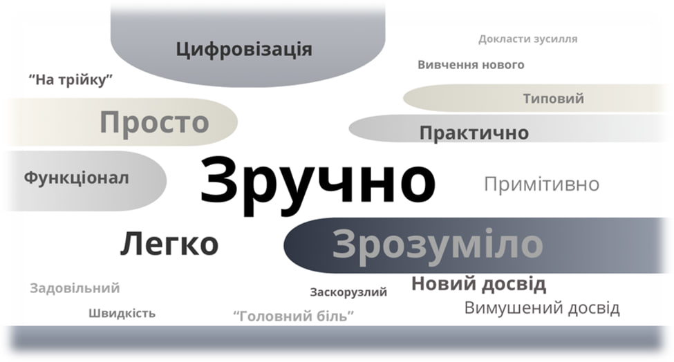
Ілюстрація_асоціативний ряд
At the same time, additional associations related to digitalisation emerged in some groups. Some participants from the younger and middle-aged groups described the Register as a manifestation of ‘the state in a smartphone’ and a step towards future online voting.
‘The State Voter Register is all the people who are eligible to vote, taken together. But for some reason, I suspect that they’ll eventually do something with this – digitise it, perhaps – and we’ll even be able to vote somewhere along the line...’ (female, aged 22).
Participants aged 25–59 demonstrated the most pragmatic understanding, referring to concepts such as systematic organisation and digitalisation. For them, the SVR is, first and foremost, an electronic tool designed to simplify electoral procedures.
‘The first thing that comes to mind is the association with “the state in a smartphone”. In other words, it’s a tool that helps fulfil the function of elections. This is a list of voters created in electronic form’ (male, aged 54).
Members of the older age group, alongside viewing the SVR as an electronic program or database, demonstrated an understanding of its practical function: enabling voters to verify their inclusion in the voter list and find out which polling station they are assigned to. A similar emphasis is evident among IDPs as well: several participants associated inclusion in the Register with the ability to vote and the Register itself with the verification of their personal information.
‘To me, it’s not an electronic system; it’s just a register where I can check whether I’m on the lists and which polling station I’m assigned to’ (male, aged 60+).
At the same time, some participants expressed concerns arising from their associations. One of the participants from the group of citizens who do not reside at their registered address/IDP linked the SVR with the transfer of her personal data to the ‘administrative resource’.
For some respondents living abroad, the very word ‘Register’ evokes a sense of pressure from the state system.
‘For me, it’s perhaps not so much an association, but rather a faint sense of fear and uncertainty. The term “state register”, it sounds kind of harsh, somehow ambiguous... it’s like being inside a cage’ (male, aged 35, Ukrainian citizen abroad)
Previous Experience Using the ‘Voter’s Personal Account’
Before the FGS, participants were asked to complete two tasks in the ‘Voter’s Personal Account’: verify their inclusion in the State Voter Register and attempt to follow the procedure for submitting a request to change their electoral address, without actually submitting the application.
For the vast majority of participants across all focus groups, completing the homework assignment was their first experience interacting with the ‘Voter’s Personal Account’ online. Participants attributed their lack of prior experience, in part, to having no need to use the service. One of the participants noted that they had previously received information about elections and their polling station via paper invitations, so there was no need to independently check their information in the Register.
‘In the past, paper notices would arrive at the post office; it was never the case that anything needed to be checked. They used to send paper notices by post... You would take that piece of paper with you, show your passport, and vote. In other words, there was simply no need to register anywhere or verify anything’ (male, aged 59).
Isolated instances of prior use of the Voter’s Personal Account were recorded among the 25–59 age group. One participant had previously used the service to change their electoral address because they had served as a member of an election commission outside their voting location. In 2019, another participant verified their inclusion in the Register amid rumours that some voters might not be included on the lists.
‘Back in ’19, there were some silly rumours going around... Regarding ’19... that anyone who has an opinion of their own might just get “lost” from the Voter Register entirely... In ’19, I checked whether I was on the voter list. It turned out I was there, and I felt relieved’ (male, aged 54).
USER EXPERIENCE ANALYSIS
Home Page and Navigation of the ‘Voter’s Personal Account’ Service
Overall, participants perceive the ‘Voter’s Personal Account’ as an official and restrained government service. However, its current interface does not fully meet some users’ expectations of modern, clear and user-friendly government digital services. During the discussion, participants also compared the service with Diia, which some regarded as a familiar example of a government digital service.
The main difficulties are related not so much to the amount of available information as to the way it is presented and how the navigation is organised. Some section titles and terms are not sufficiently clear to users, while duplicated menu items further complicate the perception of the page. This is particularly evident among older people, for whom small print and the poor readability of certain elements pose an additional barrier.
The ‘Help’ section is a separate issue. Users expect it to provide practical answers to common questions and step-by-step guidance on how to use the service. Instead, the available information is perceived primarily as legal in nature and not sufficiently useful for addressing specific problems.
The format in which the website is used also has a significant impact on the user experience. Younger respondents and citizens living abroad tend to favour quick interactions and smartphone use. However, on mobile devices, some navigation elements become less intuitive: the side menu is not displayed, and some elements at the top of the page are represented by icons only.
For citizens residing outside their registered address, including IDPs and citizens living abroad, the need to quickly get an answer to a specific question or complete a specific action is particularly pressing. Some participants from these groups requested a more personalised interaction format, where users see their own information and available actions immediately after signing in, without having to figure out the website structure on their own.
Thus, the primary request from users is to simplify interaction with the service. First and foremost, this concerns clear terminology, logical navigation, mobile-friendly design, accessibility for people with diverse needs, and a shift from a predominantly informational format to a service-oriented one, in which users can quickly understand what options are available to them and what action they need to take.
- Young people aged 18–24
Younger respondents generally navigate the website structure quite easily and do not experience significant difficulties in understanding the main navigation. However, the visual design is perceived as monotonous and insufficiently modern. When comparing the website to the digital services they use every day, respondents expect greater visual clarity, clearly highlighted content blocks and simpler presentation of information.
‘As for it being clear, well, yes, it really is clear... I also miss colours. And, perhaps, some separate, more eye-catching content blocks. For example, the “Inclusion Verification” block. You click on it, and then you can check your inclusion there. As it is now, everything is presented as monotonous text’ (female, aged 22)
Some difficulties arise when using the website on a smartphone. In the mobile version, some navigation elements become less intuitive: the side menu is not displayed, and some elements at the top of the page are represented by icons. An additional inconvenience arises from the need to switch between the website and Diia when performing certain actions.
‘I also logged in, first from my phone, and then from my PC. And I can confirm that using a PC is much more convenient, since you can interact with the Diia app on your phone at the same time. So, if you do everything from a single device, namely your phone, you will have to keep switching back and forth between the Diia app and this website. And it’s not that convenient’ (male, aged 19)
- Respondents aged 25–59
Respondents in this age group perceive the website as official and restrained, which aligns with their expectations of a government resource. At the same time, the visual design seems outdated to many. In this context, the website is compared to more modern government digital services, and a corresponding level of usability and visual clarity is expected.
‘It looks like some kind of, I don’t know, a splash screen from a late-1990s video game. I mean, it’s very… Maybe it’s actually a good thing, so there’s nothing superfluous. But at the same time, it looks kind of old-school, as young people would say’ (male, aged 54)
Some interface elements raise concerns regarding their placement and functionality. In particular, respondents point to the duplication of navigation elements, the contrast between different parts of the page and the limited usability of certain features. Spending a lot of time on a page with numerous similar elements is perceived as making it more difficult to find the required information.
At the same time, respondents in this group do not expect a government website to be overly visually striking. The restrained design and the absence of superfluous elements are viewed positively; however, they should be combined with a modern layout and intuitive navigation.
‘The page is OK as well. My first impression when I saw it was that there was nothing unnecessary. It looks like a government agency’s website. Nothing colourful there, nothing overly bright or particularly eye-catching. It is clear and to the point. It has a formal feel, with official information. I suppose that is how it should be presented’ (female, aged 48)
- Respondents aged 60 and older
For respondents aged 60+, readability is the main barrier when using the website. Small font sizes and insufficiently prominent interface elements make it difficult to perceive information. In particular, users may overlook features related to assistance and accessibility for people with visual impairments.
Terminology presents additional challenges. For example, the term ‘Inclusion Verification’ is not clear to everyone without additional context (for some participants, a phrasing that explicitly refers to inclusion in the State Voter Register would be more easy to understand).
‘Inclusion verification… well, I think some people might not understand what it means. Some older people might not understand “Inclusion Verification”… or even “Check Inclusion in the Voter Register”, because they might wonder: inclusion where? Where is it being included?’ (female, aged 60)
Furthermore, some terms, such as ‘Open Data’, are not immediately clear to the average user. This creates an additional need for explanations and prompts directly within the interface.
‘“Open Data” probably refers to data that is not personal, but some kind of… I don’t know what exactly is included in “Open Data”. I have no idea what that list might contain’ (male, aged 31)
- Citizens residing outside their registered address / IDPs
For this audience, finding specific information and taking a specific action are of key importance. Respondents do not always understand which specific section they need to go to in order to resolve their issue. In particular, the ‘Applications, Requests’ section is found more by a process of elimination than because its name is self-evident.
This creates a demand for a more personalised service format. Respondents suggest that, after signing in via BankID or Diia, users should be taken to a personal account displaying their current data and the specific actions available to them. In respondents’ view, this approach would reduce the time needed to find relevant information and eliminate unnecessary steps.
‘So, you’ve come to this page, right? And at this point, it’s not entirely clear to an average user how to view their own information. Sure, there is a page to check the inclusion of applications. But if I had already, as they say, logged in, and could see my own profile and personal details right there, things would be much clearer. Well, here, I can check if I’m in the register and see if there are any elections available to me. That could be much faster for an average user. For those accustomed to government services, I use them a lot myself, such as the taxpayer account and some other registers, so I have no problems with this. For an average user, though, I’m not sure how convenient it is. It would be easier if it worked like Diia: you enter your electronic key and are taken straight to your profile’ (male, aged 38, residing outside his registered address)
- Ukrainian citizens abroad
For citizens living abroad, quick access to the information they need is particularly important. Respondents expect to be able to resolve typical election-related queries within a few minutes, without having to read through large amounts of text.
Focus group participants noted, on the one hand, the outdated design with bureaucratic elements, and on the other, the presence of a description that helps one understand the website’s capabilities.
‘Overall, the interface is very outdated, with a lot of text. But, on the other hand, that’s actually a good thing, because this text already explains everything: what you can click and where. Yes, overall, it feels very bureaucratic for a government website. Well, it does have a somewhat bureaucratic feel to it’ (male, aged 27, Ukrainian citizen abroad)
In this context, there arises a need for a more convenient search function, clear action algorithms and additional tools for quick consultation: keyword search, answers to frequently asked questions, support chat. For citizens residing abroad, practical information is particularly relevant: what documents are required to change one’s electoral address, where the corresponding overseas polling station is located, how long the application processing might take, and whether a confirmation of the address change will be received.
User Account Navigation. Navigation Buttons.
Most respondents did not notice the menu buttons on the left, or the buttons were not displayed at all, particularly in the mobile version. That is precisely why almost all respondents used hyperlinks highlighted in blue to complete the task.
Ілюстрація_навігація в кабінеті
The navigation buttons in the top-right corner remain unnoticed by some respondents, both in the desktop and mobile versions of the website. This is particularly true of participants in the middle-aged and older age categories.
‘I was doing the assignment on my phone. So when I opened the website, I thought it was just the menu written. I mean, usually there’s highlighting or a breakdown by category, but here, it wasn’t very clearly highlighted. For some reason, I didn’t notice the menu on the side. But, generally speaking, everything is clear’ (female, aged 22)
The ‘Install’ button causes additional difficulties. Some participants in the middle-aged group did not understand the purpose of the button or what would happen when they clicked it.
Analysis of How Users Perceive and Understand Each Section of the Home Page
At first glance, respondents find the sections of the home page easy to understand: one can intuitively guess what each of them means from the titles. However, further discussion revealed that this level of clarity is insufficient for confident use of the services. Some respondents noted that, without descriptive information, it is difficult to understand exactly what they can do or what information they will find in a particular section.
Respondents consider basic services to be the most understandable and necessary: these are ‘Inclusion Verification’ and ‘Applications, Requests’. At the same time, some questions arise regarding the content and expected functionality of the ‘Polling Station Search’ and ‘My Elections’ services. The ‘Open Data’ section proved to be the most problematic. For most participants, its purpose remained unclear even after reviewing the descriptive information.
The ‘User Guide’ deserves special mention. Although this section could potentially help users better navigate the website, its placement at the bottom of the page renders it inconspicuous and effectively unused.
‘No, for me, for instance, it’s clear what follows the blue letters once I finish reading. If you simply glance at the blue text (and it does catch the eye immediately), it still takes a few seconds to actually process that information and realise what it means. And as for the specific points, it’s better to read the clarifications, well, for me, it’s not a problem’ (male, aged 51)
It is also worth noting the assessment of one participant who was referring specifically to the home page of the ‘State Voter Register’ website, rather than the home page of the ‘Voter’s Personal Account’, which was assessed by the other respondents. According to him, upon visiting the website, he was unpleasantly surprised by the amount of information and elements presented on the home page, and found it overloaded.
‘...the home page is overloaded with statistical information. There’s so much information of all kinds that it’s difficult to find your way around. Yes, it is worth noting that the “Voter’s Personal Account” is visible; it is positioned separately in the top-right corner. In other words, it stands out. And this page that you’ve opened now, here, it seems more straightforward and informative to me. But the home page is just too overloaded, in my opinion’ (male, aged 41)
A detailed analysis of each section of the ‘Voter’s Personal Account’ home page is provided below:
- ‘Inclusion Verification’
The ‘Inclusion Verification’ section is one of the most prominent elements on the home page, which is why respondents most often notice it first. In general, the purpose of the section is clear: users associate it with the ability to check whether they are included in the State Voter Register and find out which polling station they are assigned to.
At the same time, the title of the section presents some difficulties in terms of perception. Some respondents find the wording ‘Inclusion Verification’ incomplete, as without additional context it is unclear exactly what kind of ‘inclusion’ is being referred to. This perception is particularly common among participants in the older age group, although younger respondents draw attention to this issue as well.
‘I might have a different perspective regarding the title. “Inclusion Verification” – that’s perhaps a bit unclear. Looking back now, I realise that it was the explanation that helped me understand exactly where to click. Perhaps the title should be changed somehow, without any prior explanation’ (male, aged 20)
- ‘Applications, Requests’
The purpose of the ‘Applications, Requests’ section is not clear to all users when they first visit the website. However, after reviewing its content, respondents understand that this is exactly where they can perform actions related to changing or updating their electoral data.
The greatest difficulties arise when trying to find a way to change one’s electoral address. For some participants, it was not obvious that the option to change their electoral address could be found specifically in the ‘Applications, Requests’ section. The title is primarily associated with general enquiries, applications or complaints submitted to government or municipal institutions, rather than with specific actions related to electoral data.
Because of this, users have to search for the relevant function within the subsections or rely on additional explanations. At the same time, respondents find it clearer when a common and important action, such as changing one’s electoral address, is accessible directly from the home page.
The level of digital literacy also affects the search for the required function. Users with extensive experience of utilising online government services get to understand the section structure more quickly. For some young respondents and IDPs, finding the necessary form requires more time and additional navigation.
Thus, the main issue with this section lies not in the complexity of the functionality itself, but in the fact that its presentation is not sufficiently intuitive. Moving the most sought-after actions, such as changing one’s electoral address, to a more prominent position could make them easier for users to find.
‘I spent quite a while looking for it compared with the “Inclusion Verification” service. I checked the user guide. I didn’t want to log in via Diia again for no reason. It was easier for me to just check the user guide and read about what could be done in “Applications”. So I go there. And I found out there that it’s possible to submit an application to change my polling station’ (female, aged 20)
‘Perhaps it would make sense to separate things out a bit here; for instance, include a specific “Application for Change of Electoral Address”, along with separate inquiries, so that a person doesn’t get lost. Then again, those who seek will always find. Most likely, sooner or later, by clicking on these buttons, a person will find what they need’ (male, aged 54)
- ‘Polling Station Search’
Respondents understand the general purpose of the ‘Polling Station Search’ section as the ability to locate a polling station by address or by searching on a map. However, some participants questioned the need for a separate section, as information about their polling station is already available after using the ‘Inclusion Verification’ feature.
After verifying their inclusion in the Register, the user receives information about their polling station, including its number and address. Therefore, some respondents see no need to use the ‘Polling Station Search’ feature separately, perceiving it as duplicating functionality that is already available.
However, respondents identify a specific scenario in which this feature could be useful. This concerns, in particular, people who reside outside their registered address and wish to find a polling station at their current place of stay, even before the relevant changes are recorded.
Thus, the value of having a separate ‘Polling Station Search’ section for users is currently not sufficiently clear. The main question is whether it should remain a standalone navigation element, given that its functionality partially overlaps with ‘Inclusion Verification’ service, or if it requires clear positioning for specific use cases.
‘“Polling Station Search” – it explains in detail how you can search by address or on a map’ (male, aged 26, residing outside his registered address)
‘“Polling Station Search” – well, I honestly don’t see the point, given that we’ve already established which polling station we’re assigned to. Why would we need to look for anything else?’ (male, aged 60+)
‘It seems to me that “Polling Station Search” is for when a person has deregistered from one location, such as their previous place of residence, and moved to another, and they don’t know which polling station to go to for the address where they currently live. And in this “Polling Station Search”, you can open it, enter your approximate address and find the polling station there’ (female, aged 60)
- ‘My Elections’
The ‘My Elections’ section is one of the least clearly understood by respondents and raises numerous questions about its purpose.
User expectations regarding the content of the section differ significantly. Some respondents expect this section to contain a personal record of their voting history, which in turn raises concerns about a potential breach of secrecy of the vote. Others interpret the title as referring to a personalised section where they can view the elections they are eligible to vote in or other information relevant to their profile.
Describing the ‘Election Campaigns You Can Participate In’ section presents additional difficulties. Under martial law, some respondents perceive this wording as merely formal, irrelevant, or failing to convey the actual purpose of the section.
Thus, the title ‘My Elections’ does not provide users with a single, unambiguous understanding of exactly what information they can obtain here.
‘I’m more concerned about the “My Elections” section. I just can’t grasp the logic behind this section. It turns out that all the elections you participated in are included here. And here, the secrecy of the vote is lost. Whether you voted or didn’t vote. It just doesn’t feel quite right’ (male, aged 35, Ukrainian citizen abroad)
‘I just read “My Elections”. You’ll see a campaign you can participate in. It is simply like blasphemy, like mockery, to write when there are no elections. It just ends up being completely hollow’ (male, aged 35, Ukrainian citizen abroad)
- ‘Open Data’
The ‘Open Data’ section is one of the most problematic in terms of how it is perceived by average users. Some respondents associate its title with the possibility of public access to personal information, including electoral address or other voter details. This raises concerns regarding the privacy and security of personal data.
Concurrently, the technical nature of the information presented, including references to XML, datasets and other technical formats, is unclear to most respondents. Only a few users interpret this section as a source of anonymised statistical data that could be useful for analytical work.
‘Now, “Open Data” is a set of incomprehensible words. It’s genuinely unclear what this is. Reading this explanation… it makes no sense at all’ (female, aged 52, Ukrainian citizen abroad)
‘Like I said, basically, everything is clear. In the “Open Data” section, there’s some data regarding voters, electoral districts, some administrative units. In other words, more general data that is needed for analysis. So, it has to be in the “Open Data” section. Open to the public, but exclusively for the purpose of analysis’ (male, aged 24)
‘Subjectively speaking, everything was clear. And the explanations are quite easy to understand. However, regarding the “Open Data” section, I suspect that users might have questions about the XML format, specifically, what it is and what kind of format it is. That is why I would add more explanations here’ (male, aged 19)
- ‘Feedback’
The title and overall purpose of the ‘Feedback’ section are clear to respondents. Users perceive it as a channel of communication with the resource’s administrators or developers.
At the same time, respondents view submissions made through this section primarily as a way to resolve problematic or critical situations, rather than as a channel for routine inquiries or general communication. In particular, users expect to reach out here when the system malfunctions, a verification code is not received, the process gets stuck in a loop, or the verification result states ‘Voter Not Found’.
Perceptions and intentions regarding the use of the ‘Feedback’ tab were observed across various target audience (TA) categories:
- Young people aged 18–24 expected the ‘Feedback’ section to provide a step-by-step guide on what to do if a problem arises. For example, they would look there for instructions or an option to register if a person is not on the lists. Participants also saw this section as an opportunity to contact Register representatives and receive a direct response, viewing the tab as a channel for communicating with a ‘live’ support team. It can be concluded that young people expect the ‘Feedback’ section to offer interactive assistance rather than merely static information.
- The older generation (aged 60+) viewed ‘Feedback’ as one of two possible online channels for resolving an issue, alongside the ‘Applications, Requests’ section.
- Some participants among citizens residing outside their registered address (including IDPs) noted that they would use the ‘Feedback’ section as a way to avoid the complicated process of searching for the necessary forms throughout the website. According to respondents, accessing this section allows users to bypass complex navigation and immediately obtain a link to a form or instructions on the next steps.
- Citizens living abroad referred to ‘Feedback’ as a backup channel for determining the reasons for their absence from the lists. They explained that if the primary tools failed, this specific section could provide clarification or direct them to the appropriate follow-up procedures. For them, the tab served as a ‘safeguard’ mechanism, ensuring that they could obtain a response remotely.
The examples provided confirm the conclusion that the ‘Feedback’ tab is perceived not as a primary verification tool, but rather as a reference support channel to be used in the event of an error or missing data in the system.
At the same time, respondents expressed a need for a more prompt format of support. Instead of a standard inquiry form, they propose implementing a chatbot or a hotline that would allow for faster answers on how to handle a problematic situation.
Thus, while the feedback channel itself is clear to users, their expectations regarding it are more focused on receiving prompt assistance in resolving a specific issue.
‘“Feedback” probably means a way to contact the website developers and ask them some corresponding questions if there is something I do not understand’ (male, aged 60+)
- ‘User Guide to the SVR Services’
The section has practical value for navigating the services, yet it remains inconspicuous to some users.
When completing the task independently at home, most respondents did not notice the text link to the user guide located at the bottom of the page. At the same time, users who found the user guide or reviewed it during moderation evaluated it positively.
In particular, respondents note that the user guide is more detailed and easier to understand than the ‘Help’ section, and contains specific step-by-step action algorithms. In their view, this format is more useful when utilising the services independently, as it allows for a better understanding of the sequence of steps during logging in and submitting applications.
Thus, the problem with the user guide lies primarily not in its content, but in its placement and low visibility. At the same time, in terms of its format and practical value, it can serve as a benchmark for improving other reference materials on the website.
‘Help’ Section
The vast majority of respondents across all focus groups either did not notice the ‘Help’ link at all or did not consider it necessary to use, as they were confident they could complete the task independently. The ‘Help’ section is particularly inconspicuous in the mobile version of the website, as it was displayed only as an icon without a text label. This was most frequently pointed out by young people and IDPs.
‘I saw the “Help” section and checked it out, but there’s nothing really helpful there; it was already clear enough how to complete these tasks’ (male, aged 60+)
‘Actually, what I meant to say wasn’t that I didn’t see it. It was that the word itself, along with the “Help” link, is highlighted in a way that is, one might say, less effective than the other sections. Therefore, this specific link is not immediately noticeable to the user. It is easier to see, for example, “Feedback” a bit further down, or ID.gov.ua. But not the “Help” section’ (male, aged 24)
Participants also pointed out the discrepancy between the ‘Help’ label and the actual content of this section on the home page. Instead of step-by-step instructions, action algorithms, or answers to frequently asked questions, the section contains primarily legal information: extracts from legislation on personal data protection and the privacy policy. For this reason, respondents do not perceive it as a source of practical assistance while using the website.
‘Here, it’s simply consent to the processing of personal data, and assistance for whom? With the collection of personal data, it turns out’ (male, aged 35, Ukrainian citizen abroad)
Another issue is the way the ‘Help’ section opens on desktop. The few users who attempted to use this section noted that the window opens as an overlay on the current page and cannot be opened in a separate tab. This makes it inconvenient to use the prompts, as it is difficult for the user to simultaneously view the guidance and perform the necessary actions on the website.
‘You can’t open it in a new tab by right-clicking, because it doesn’t have that functionality. Because it says “blocked”. You can only click it. And then it pops up right in the middle of the screen. It’s inconvenient. Basically, it’s like having a screen within a screen. Sure, perhaps 90% of users prefer the intended default behaviour, where you click something, and it appears on top of the screen. But I find it more convenient to open it in a separate tab so I can take my time and look through the information. That option isn’t available here; it’s missing by default’ (male, aged 54)
Some respondents who opened the ‘Help’ section on the home page and found legal information there noted that this content did not align with their expectations for that section. Meanwhile, participants did not always notice that the content of the ‘Help’ section on internal website pages may vary depending on the context and contain more relevant tips, for example, when completing an application. At the same time, some discussion participants negatively evaluate the variations in information within the section depending on the service being viewed.
‘It’s just a disaster. I’ve never seen anything like this; I don’t know, but this is... Well, whatever. You’ve surprised us, but, to be honest, it’s an unpleasant surprise… In my view, things shouldn’t be this way. It shouldn’t work this way. It should all be intuitively clear. And here, you’ve put it together like a puzzle, aha, the picture is revealed. Then someone else puts it together, and nothing appears. Honestly, it’s just a disaster’ (male, aged 40, Ukrainian citizen abroad)
At the same time, the experiences of some respondents showed that the content of the ‘Help’ section on internal website pages can meet users’ expectations. In particular, one of the participants consulted the ‘Help’ section after reaching the ‘Inclusion Verification’ step, as they wanted to ensure they were following the required steps correctly. According to his assessment, the information in this section was useful.
‘Look, I opened the “Help” section on a different page. I opened the “Help” tab on the page after I had already clicked on “Inclusion Verification”. Because I wanted to find out whether I was doing everything correctly and get some additional information. And the information provided there is indeed useful. Everything is explained in detail there, so to speak’ (male, aged 54)
Study participants suggested a clear distinction between two types of information: legal information and practical assistance to the user. Respondents consider it appropriate for a government website to provide explanations of relevant laws and regulations, but emphasise that labelling legal text as ‘Help’ is misleading to users. Specifically, it was suggested that the current content under ‘Help’ be renamed to ‘Legal Information’ or ‘Privacy Policy’, while the ‘Help’ section itself should provide practical tools for users: step-by-step instructions, clear action algorithms, finding answers to frequently asked questions, etc. The suggestion to introduce a ‘live’ chatbot was also viewed positively.
‘This information is important from a legal standpoint. But for me personally, or for other users, it is unlikely to be truly helpful’ (male, aged 54)
‘Yes, I can also add that the “Help” section would be better designed as a search tool, where you could enter your query – for example, if you were looking for how to change your voter registration. And just like that – you land on the right page, and you can go straight to making changes, instead of having to search all over the website’ (female, aged 36, Ukrainian citizen abroad)
‘It seems to me that, perhaps on the same page as “Help”, they could set up a hotline or a chatbot in one of the messaging apps. Because sometimes people have questions that are, well, personal in nature’ (female, aged 26, residing outside her registered address)
Some respondents aged 60 and over noted that the reference to the Law ‘On Personal Data Protection’ made them feel somewhat reassured and gave them a sense of security.
‘You could say it gives you some reassurance that the information you provide won’t be used or shared online or anything like that, and that your personal data is protected’ (female, aged 62)
Respondents emphasised that the ‘Help’ section should contain not only hints on where to find necessary information or how to perform a specific action on the website, but also detailed, practical instructions to guide the user through the entire process from start to finish.
In particular, participants expect this section to provide explanations of technical and organisational aspects that may arise when submitting an application: how to obtain or access an electronic identification key, how to create Diia.Signature, what documents need to be prepared to change one’s electoral address or be included in the State Voter Register, in what format they need to be submitted, whether a photograph of the document is sufficient, or if a scanned or notarised copy is required, etc.
Thus, for respondents, the value of the ‘Help’ section lies primarily in its ability to provide specific answers to the questions ‘What exactly do I need to do, and what do I need to prepare?’ rather than simply offering general information about the website’s functionality.
‘For instance, a person might come in regarding the elections or to check information about themselves. There should be instructions on how to do this, in case it isn’t clear from the link or the navigation path. It might also be worth specifying what information needs to be provided. Because, for those accessing via phone – I haven’t checked, but it’s possible that things shift around and some sections aren’t visible. So that the person knows they need to provide information about themselves. And in the “Applications, Requests” section, if anyone has seen it, there is an option to upload documents. So perhaps the “Help” tab should explain exactly which documents are required and in what quality, whether they need to be signed, or whether a regular photo or a scan is sufficient. That sort of information’ (male, aged 38, residing outside his registered address)
It is also worth noting the views of some participants from the IDP category, who felt that the information in this section did not address a number of practical questions. In particular, participants would like to understand what to do if their assigned polling station is located in an occupied territory and which documents can be used to confirm their actual place of residence.
Version for People With Visual Impairments
One of the focus groups included a participant with visual impairments; therefore, a corresponding version of the website was also tested as part of the study. Some respondents in the older age group also noted that this feature was relevant to them, given the small font size and the large amount of text information on the website.
At the same time, testing did not generally yield positive assessments of the website version designed for people with visual impairments. Respondents primarily noted its black-and-white design but did not understand how this change made the information easier to perceive.
Particular emphasis was also placed on the fact that the button for switching to the corresponding version of the website was not sufficiently prominent. According to respondents, it is difficult to find, especially for people with visual impairments.
Respondents also pointed to the lack of voice prompts as an additional tool that could make the website easier to use for people with visual impairments.
‘On the tax authority’s e-services website, there’s a “Login” button, and right next to it, a “Login for People With Visual Impairments” option. And this, well, I never fail to notice it! Whenever I visit the website, it’s the first thing I see. That’s why it’s important’ (female, aged 60)
‘Inclusion Verification’ Service
Verifying Inclusion in the State Voter Register in Figures (Homework Completion)
Study participants were given a homework assignment: to verify their own data in the State Voter Register. After completing the task, respondents filled out a short form in which they evaluated the completion process and indicated the main difficulties and specific aspects they encountered.
The results presented below cover all surveyed participants, including ‘reserve’ respondents who completed the task but did not directly take part in the focus group discussions.
! The quantitative data presented below are descriptive and reflect the responses of participants in the qualitative study. The obtained indicators are not statistically representative of the population of Ukraine and cannot be extrapolated to the general population.
Distribution of respondents by gender, % of respondents, N=47
|
Gender |
% |
|
Males |
45 |
|
Females |
55 |
Task completion time, % of respondents, N=47
|
Completion time |
% |
|
More than 5 minutes |
11 |
|
2–5 minutes |
51 |
|
Less than 2 minutes |
38 |
The majority of study participants (89%) spent up to 5 minutes completing the task. Overall, this amount of time is considered adequate for a task of this nature.
Distribution by degree of task completion, % of respondents, N=47
|
Completion status |
% |
|
Completed in full |
92 |
|
Completed partially |
6 |
|
Failed to complete |
2 |
The vast majority of respondents completed the task in full. Only 8% of study participants were unable to complete the task, either partially (6%) or entirely (2%).
Difficulties encountered while completing the task, % of respondents, N=47
Most respondents experienced no difficulties while completing the task. However, around a quarter of respondents encountered certain obstacles, including errors when entering data manually and discrepancies between the actual names of streets and districts and those recorded in documents.
|
Documented difficulties |
% |
|
Difficulty finding the locality |
2 |
|
Problems with obtaining an identification code |
4 |
|
Technical difficulties (device malfunction or an accidental processing error) |
4 |
|
Discrepancies between actual geographical/administrative names and those recorded in documents |
6 |
|
Error in manual data entry |
9 |
|
No difficulties |
75 |
Assessment of the ease of task completion, % of respondents, N=47
Scale: from 1 to 5, where 5 is the highest level of ease.
|
Assessment |
% |
|
5 |
43 |
|
4 |
43 |
|
3 |
10 |
|
2 |
4 |
Most of the study participants (86%) rate the task as easy.
Clarity of the verification result, % of respondents, N=47
|
Clarity |
% |
|
Yes, everything is clear |
96 |
|
Partially clear |
2 |
|
Task not completed |
2 |
The vast majority of respondents found themselves in the SVR and noted that the verification result was clear to them and met their expectations.
Result of verifying inclusion in the Voter Register
|
Result |
% |
|
Found themselves in the SVR |
94 |
|
Did not find themselves in the SVR |
4 |
|
Task not completed |
2 |
Proximity of the polling station to the actual place of permanent residence
(‘Is the address of the polling station provided close to your current place of permanent residence?’)
|
Result |
% |
|
The polling station is located nearby |
71 |
|
The polling station is far away |
23 |
|
Did not find themselves in the register |
4 |
|
Task not completed |
2 |
Most respondents noted that the data obtained were displayed correctly and that their polling station was located close to their actual place of residence. Overall, the results are consistent with the distribution of the TA between those residing and those not residing at their registered address. This suggests that there is a considerable proportion of users who, under the current conditions, may need to update their details in the State Voter Register.
User Journey When Verifying Inclusion in the State Voter Register.
-
High visibility of the link in the central block: for the vast majority of respondents across all focus groups, the prominently displayed blue ‘Inclusion Verification’ link/button in the central block of the home page served as the primary and most obvious point of reference.
- Low visibility and overlooking of the side menu: most users ignored the left-hand (side) menu due to the lack of colour accent, its contrasting black background (which caused visual fatigue) or its complete absence from the mobile version.
- Erroneous click paths: a few respondents who did not grasp the meaning of the term ‘inclusion’ assumed they would look for a self-verification feature in the ‘My Elections’ or ‘Polling Station Search’ sections.
Ілюстрація_куди заходять для перевірки
Respondents’ Assessment and Impressions of the Form of Verifying Inclusion in the Register
According to the majority of respondents, the form for verifying inclusion in the Register is clear and easy to fill out. The main fields (full name and date of birth) do not pose any significant difficulties, and the verification process itself takes a few minutes. Respondents also view the speed of receiving the result and its level of detail positively.
However, while filling out the form, some respondents experienced difficulties when searching for their localities and understanding certain wordings. The drop-down list of localities is not always convenient to search, and the button for expanding it is not sufficiently prominent.
Some terms, particularly ‘declared place of residence’, ‘region’ and ‘district’, are not perceived as clear and unambiguous by all respondents. For some discussion participants, the term ‘region’ is associated with various geographical concepts, including macro-regions (West, East, South and North). Some participants suggested replacing it with the more familiar term ‘oblast’ (administrative region). There are also difficulties in understanding the ‘district’ field, in particular the difference between a district of an oblast and a district in a city.
Some discussion participants reported difficulties interpreting the meaning of the ‘Patronymic absent’ entry. However, this did not significantly hinder their ability to proceed with the task of verifying their inclusion in the SVR.
Ілюстрація_пошук населеного пункту
One of the most significant barriers is the need to receive a confirmation code via email. For younger users, this is essentially just an additional step. For some older respondents, however, the lack of an email address or a suitable device effectively makes it impossible to complete the verification process. Separately, participants highlighted the inconvenience of having to enter a long 8-digit code and delays in receiving it.
Problems also arise when the system fails to find a voter or displays outdated information. In such cases, simply explaining the result is not enough for users: they do not understand why the problem has occurred or what they should do next.
Specific difficulties arise when the verification result does not match the user’s expectations – for example, when the system displays a polling station that does not correspond to their actual place of residence. The discussion revealed that participants do not always clearly distinguish between an electoral address, a registered or declared place of residence, their actual place of residence and a temporary change of voting location. Hence, a valid verification result may be perceived as outdated or erroneous. This highlights the need to explain more clearly to the user what their electoral address actually means and why a particular polling station appears in the verification results.
At the same time, it is worth noting that almost all participants were able to complete the task, taking no more than 5 minutes on average.
Thus, the basic logic of the form is clear to most users, while the main difficulties relate to specific form elements and non-standard situations during verification. Key areas for improvement include providing alternatives to email verification, simplifying locality search, using clearer wordings and offering straightforward guidance on further steps in the event of a negative or unexpected result.
Assessment of Verification Code Delivery Channels and Formats
Overall, respondents perceive receiving the verification code exclusively via email as a limitation. For different users, email may be inaccessible, inconvenient, or a less reliable channel. They would therefore like to be able to independently choose how to receive the code, including via SMS or messaging apps (Viber/Telegram). At the same time, the needs of different categories of users vary: while SMS appears to be the most convenient option for the older generation, email remains an important and often the most accessible channel for citizens living abroad, as receiving SMS messages on a Ukrainian phone number while overseas may depend on roaming services, a sufficient account balance and other technical factors.
‘I think email is better, because abroad, apparently, not all phone numbers always receive SMS. Either the tariff must be paid, or it is not possible to receive a call, not a call, but an SMS’ (male, aged 35, Ukrainian citizen abroad)
‘It’s even possible to offer a choice, for example, younger people might prefer email, while for older people, it would be better to receive communications via phone’ (female, aged 60)
‘That’s why an email address is necessary, because the code is sent exclusively to the email address, right? We won’t be able to do this without email. And what should elderly people do who don’t have email? Who knows. It might make sense to link a phone number here. After all, everyone has a phone. And there would be SMS messages to the phone number. Even elderly people, who have some Nokia from 2001, receive SMS messages’ (male, aged 45)
A separate issue is the code format itself. Some respondents consider the 8-digit code too long and inconvenient to enter manually. Some participants noted that, to do this, they had to write the code down on paper or repeatedly return to the email. A shorter code or the option to copy and paste it automatically would be more convenient.
‘…regarding the code, I’d like to point out that it consists of 8 digits. And the code is far from simple, it’s neither four digits nor two digits long. And the 8 digits need to be copied over from the email address!’ (male, aged 41)
Users also experienced delays when receiving the code via email. The email does not always arrive immediately and may end up in the ‘Spam’ folder, while a new code can only be requested after 15 minutes. Study participants considered this waiting period quite lengthy. Such situations make the verification process more difficult and time-consuming.
‘For some reason, the first time, I was absolutely sure I had entered my email address correctly, but the code still didn’t arrive. And even after that, after 15 minutes, when they allowed to send a new code, then it came right away’ (male, aged 20)
Thus, respondents’ primary request is not to eliminate email as an option entirely, but to allow users to choose the most convenient channel for receiving the code and make the code entry process simpler.
Perception and Understanding of the Term ‘Electoral Address’ in the Request Form
Respondents perceive the term ‘electoral address’ in various ways. Most of them understand it to mean their officially registered place of residence (‘residential registration’), while some voters (especially older ones) interpret it as the address of the polling station itself (for example, the school building where voting takes place). Respondents currently living abroad also have a dual understanding of the term: some consider their registered address in Ukraine to be their electoral address, while others interpret it as the physical address of the consulate or diplomatic mission abroad to which they are assigned for voting purposes.
‘I see. An electoral address is the place where the actual voting takes place’ (male, aged 60+)
‘…I reckon this is the address of the polling station I’m assigned to’ (female, aged 33, Ukrainian citizen abroad)
‘At my registered place of residence. Because, for example, my child doesn’t live in Drohobych. But then I received this response to my request. And she is assigned to her registered place of residence, meaning that if an election were held, she would have to vote in Drohobych’ (female, aged 48)
Supplementary text in parentheses helps study participants quickly understand exactly what they need to enter. However, the wording ‘declared place of residence’ further complicates perception, as participants find it overly bureaucratic and unclear.
Respondents suggested using more familiar terms, such as ‘place of registration’ and ‘actual place of residence’, or adding brief explanations to official terms.
‘Somehow more clearly. Nowadays, a person does not necessarily have to vote at their place of registration. Perhaps he or she is living elsewhere as an IDP, or due to some other circumstances. In other words, it has to be different. I can’t say off the top of my head how, but not like this. Because “declared” sounds like total crap. Pardon my French’ (male, aged 54)
Interpretation and Clarity of the Result of Verifying Inclusion in the Register
Overall, respondents interpret the Register inclusion verification results clearly and without difficulty. For the majority, the verification logic is as follows: if the system displays the voter’s details and the polling station, it means that the voter is included in the Register.
Study participants positively view the level of detail provided in the results, particularly the ability to see the polling station number, its address, the name of the facility, and in some cases, even the floor or the specific part of the premises where voting takes place.
‘Actually, I can say that the result was quite convenient. Because, first of all, it showed the polling station itself, its number, address and street. And, furthermore, there were explanations regarding the building itself. For me, it was Gymnasium No. [so-and-so], a block or a vestibule’ (male, aged 19)
At the same time, users have different expectations regarding exactly what information the system should display. Some respondents expected only a brief confirmation of whether they were in the Register. For citizens residing outside their registered address, as well as for IDPs, the issue of having an up-to-date address is of greater importance: they expect to see information related to their actual place of residence, whereas the system may display the electoral address of a polling station based on previous data. In particular, IDPs expected to see in the verification results an electoral address corresponding to their current actual place of residence.
Some participants encountered verification results that they considered contradictory. However, users may not always find it easy to distinguish between the different procedures or understand why a specific polling station is displayed in the verification results. In one instance, the system could not locate a participant at his registered address but instead displayed him at the address where he had previously voted while serving as a member of an election commission. The participant himself explained this by stating that, several years ago, he had submitted an application to vote at a different address. However, it is impossible to clearly establish which procedure he used at that time: a change of electoral address or a temporary change of voting location.
‘… it no longer locates me at my registered address, in the Desnianskyi District. It says here: “There are no matches based on the data provided in the request”. Then it says that it locates me in the Pecherskyi District of Kyiv. … For me, to change it isn’t a big problem. However, I realise that for any citizen who has changed their electoral address on a one-time basis, for instance, due to a business trip or various other circumstances, the State Voter Register records them at the address they submitted. And this is a nationwide issue. If we have to hold elections (and at some point we will have to), this could become a very serious problem’ (male, aged 41)
A separate significant issue arises when a voter cannot be found, or when the system indicates that the Register authorities are unable to operate at the relevant address. In this case, the user does not receive a clear explanation of what to do next. Respondents expect that, immediately following such a result, the system will suggest a next step. For example, go to the relevant application or receive instructions on how to resolve the situation.
‘... if they are absent, I wonder, then there should be a link immediately to those applications or requests, so that you can go from here, let’s say, if the voter was not found according to the specified data. And check that you’re submitting the request, and there should be the link right away, so that...’ (female, aged 52, Ukrainian citizen abroad)
Thus, a standard positive verification result is, for the most part, clear and sufficiently informative. Difficulties arise primarily when the result does not meet the user’s expectations, the voter is not in the system, or the displayed address of the polling station does not match their actual place of residence. In such cases, the user lacks an explanation as to why the system is showing this specific result and what steps to take next.
Recorded Cases of Negative Search Results and Possible Reasons
In several focus groups, some respondents noted that they did not find themselves in the Voter Register during verification. Based on their experience and assumptions, several situations can be identified that may cause a negative verification result:
- Negative result following a potential change in the location of the polling station: one of the participants attributed their absence from the Register to the relocation of the polling station to different premises; however, this remained merely their assumption and does not provide grounds for establishing a cause-and-effect relationship.
‘… there was simply no voter, or something like that, I don’t even remember what happened. Because I had already used one address, then a second address where I could vote, since we used to vote at one school, but now we’ve been moved to a different school. As I understand it, the confusion might stem from the fact that elections are no longer held in one place but are held in another, and the voter’s details were not removed from the first location or transferred to the second one. I thought that’s how it was’ (male, aged 62)
- Discrepancy in the spelling of personal data: respondents encountered situations where a search yielded different results depending on the spelling of a name, such as ‘Nataliia’ and ‘Natalia’.
‘At first, I entered my details, but I wrote my name incorrectly. The thing is, my passport says Natalia, but I wrote Nataliia. The search was successful, and the system displayed that such a person exists. Then I decided to check, okay, let’s see what it says according to my passport. I entered my passport details, and it tells me that no such person exists, nothing was found’ (female, aged 36, Ukrainian citizen abroad)
- Actual absence of a voter record in the Register: one of the participants reported that he was not on the voter list during the previous elections. After submitting a corresponding application, he was included in the Register. In the course of FGS, the reason for the initial non-inclusion could not be determined.
‘It was basically clear to me. During the latest elections, I went to vote, but I wasn’t on the lists. In other words, [the application] should have been submitted in advance, even back then. I mean, I wasn’t aware that there was a website, or that you could check things through the website. I don’t know if it existed then at all. All in all, I didn’t manage to vote then. However, after that, I received a request. And I submitted an application. However, there were also some minor issues regarding the application submission. An extract from the place-of-residence register was required there. And the one generated in “Diia” wouldn’t upload there as a file’ (male, aged 24)
Respondents’ Action Algorithms and Behavioural Scenarios if Not Listed in the Register (‘What Would You Do, and How, to Get Included in the Voter Register?’)
In the event that the system does not find a voter in the Register, respondents see two main ways to resolve the issue: online and offline. The choice depends primarily on one’s habit of using digital services and confidence in one’s own abilities. Some participants would first try to resolve the issue themselves through the website, while others consider contacting a government office in person to be a more reliable option.
Those who would opt for an online approach most often mentioned the ‘Applications, Requests’ and ‘Feedback’ sections. Respondents assumed that these sections would allow them to find an application for inclusion in the Register, obtain an explanation regarding missing data, or contact the support team. However, not all respondents were sure where exactly to find the required form or whether the issue could be fully resolved online.
For those who prefer to make an in-person enquiry, the most obvious options are Administrative Service Centres, local self-government bodies, Register maintenance offices, or polling stations. This approach is particularly common among respondents with limited experience using digital services or relatively low levels of digital literacy. At the same time, contacting a government institution in person is the first course of action that comes to mind even for those who are relatively proficient in using computers.
It is worth noting that the offline options mentioned by respondents are not always correct in terms of the current procedure. The conflation of Administrative Service Centres, local self-government bodies, Register maintenance offices and polling stations indicates that it is not evident to users which specific entity is authorised to resolve issues regarding inclusion in the SVR.
Regardless of the method chosen, respondents expect the inclusion verification result itself to provide guidance on how to proceed. If the system reports ‘voter not found’, it is not sufficient for the user to simply receive a negative result. They want to understand the reason and the way to resolve the situation immediately. Respondents consider the clearest solution to be a short instruction or a direct link to the required application provided directly on the results page.
‘…if this were meant to be help, it would be better if these issues were addressed. The most common issue is, for example, that I didn’t find myself on the list. And you click here, and it actually says what you need to do if that’s the case. And this is help. And secondly, I would definitely look for a form or a feedback option to leave a message there, explain that I’m having this problem, and ask what the next steps should be’ (female, aged 36, Ukrainian citizen abroad)
‘I’d like them to explain there what needs to be done. So I wouldn’t have to go anywhere myself. So that they could sort something out online. So that there would be some buttons, so that I could...’ (female, aged 52)
Thus, the main issue is not the lack of potential solutions to the problem, but rather the fact that users have to figure out on their own which course of action to take and where to find it on the website.
Differences by TA type
- Young people aged 18–24. They most often focus on solving problems online. If the respondents are not found in the Register, they are prepared to locate the application themselves and submit it via the website. In case of difficulties, they turn to the ‘Help’, ‘User Guide’ or ‘Feedback’ sections, but at the same time they expect the system to suggest the next step after a negative result.
‘So, look, at first it didn’t find me at all. Then I was added. I submitted applications and made a request. And only then the website pulled in the information, right’ (male, aged 24)
‘I could just ignore it and do nothing further. But if I really needed to, I would look into resources on how to get reinstated there, and why such a situation might arise. And, in principle, this information has to be available somewhere on the website itself, probably in that “Help” section. Or “User Guide”’ (female, aged 22)
- Respondents aged 25–59. In the event of a problem, some respondents in this group would first turn in person to an Administrative Service Centre, a local self-government body, or another institution. The main reason for this decision is their lack of confidence in being able to complete the electronic procedure independently. However, participants view the possibility of resolving the issue online positively, provided the website clearly explains what needs to be done and how.
‘…go to the administration, go there in person. And to make sure they include the data, yes. Anyone who wants to vote will make sure they get included’ (male, aged 51)
- Among respondents aged 60 and older, there is no single approach. Some respondents would be willing to try submitting an application online first, with help from their children or grandchildren if necessary, and, if unsuccessful, visit the relevant institution in person. Others, by contrast, are determined to avoid wasting time in queues and would try to find a solution online on their own.
‘Oh... I’m very... lazy in this regard, to visit all these places and stand in lines. Things like that are very, very difficult for me. I switched to many online services a long time ago. I would go after it! I would sit, click and figure out something’ (female, aged 60)
‘City councils actually have a specific department that handles the Register. You can go to the city council or the district council and find out directly there. You can register, change your last name, update your address, or correct errors in your last name or first name’ (female, aged 60)
- Citizens residing outside their registered address / IDPs. Respondents are considering various ways to resolve the issue: from submitting an electronic application or reaching out via the ‘Feedback’ section, to making a phone inquiry or paying an in-person visit. For this category, it is particularly important to receive a separate, clear explanation of the action algorithm, as a standard notification regarding a voter’s absence is insufficient for understanding the next steps.
‘There’s a “Feedback” tab there; I’d use that, so I wouldn’t have to search what I need through the website, for instance, in “Applications, Requests” section’ (male, aged 26, residing outside his registered address)
‘I also checked another voter at the same time, so to speak. Regarding the availability of information, and he was absent from the register. And immediately a question arose: how does one get there, what needs to be done? Well, the response was to contact the location of the polling station’ (male, aged 38, residing outside his registered address)
- Ukrainian citizens abroad primarily rely on submitting an electronic application, using email, or utilising the ‘Feedback’ channel. Visiting a government office in person is not a viable option for them; therefore, a clear online procedure is of particular importance to this TA category. However, some respondents indicated that they might give up trying to resolve the issue if the procedure proved too complex or unclear.
‘… I would actually try “Applications, Requests”. First of all, to see to what extent it is possible to resolve things there. If there were a problem with that, then probably “Feedback”’ (female, aged 33, Ukrainian citizen abroad)
Alternative Data for Verifying Inclusion in the Register
Some participants, specifically among the youth, suggested minimising manual entry of personal data during verification and introducing a simpler identification method. Participants consider logging in through familiar digital services, such as Diia, BankID or a QR code, the most appealing alternative, as this would allow the system to retrieve the required information automatically without users having to enter it again.
‘I mean, it’s a great idea. The data gets pulled in automatically, just via a QR code. You have it pulled in. OK, it doesn’t matter whether it’s through your identification code or some other information. To avoid the possibility of an error, for instance, if you made a mistake when entering your email address or date of birth... This way, you can enter it properly. Perhaps someone from the older generation might think that problems will arise because of this. I clicked something somewhere: “Oops, something didn’t work”. Well, for the sake of speed and accurate data entry, it would actually be pretty cool to have a single QR code that links to “Diia”, and “Diia” links to the registers’ (male, aged 24)
At the same time, attitudes toward specific alternatives vary.
ITN (Individual Tax Number) / RNOKPP (Registration Number of the Taxpayer’s Account Card)
Attitudes towards the use of ITN turned out to be ambiguous.
Advantages pointed out by respondents are as follows:
- a unique number allows for more precise identification of a person, particularly in cases where individuals share the same last name;
- it is more difficult for an outsider to find out than a full name and date of birth, so this method is perceived as safer;
- using the ITN eliminates the need to enter a residential address or other lengthy text data.
‘… by the identification code, I think it’s already clear where a person can access their own information from the register and see where they are registered’ (male, aged 38, residing outside his registered address)
‘… there are many people who know your first name, patronymic and date of birth. And this will be more confidential information than it is now’ (male, aged 35, Ukrainian citizen abroad)
Key concerns:
- most people do not know their ITN by heart and have to look it up in their documents;
- some citizens do not have an ITN due to religious beliefs;
- some respondents mentioned potential errors and data duplication in government databases.
‘There is simply information that we keep in our heads, we know it by heart. And as for the code, it has many digits; you don’t remember it. Still, it needs to be... somewhere over there... We have to make an extra step to view it. The process becomes more time-consuming. But overall this is simpler, of course’ (female, aged 48)
‘I know there are some people who do not have an identification code; they refuse to have one for religious reasons. But they probably want to vote. Several options. If that one didn’t work out, then offer another one’ (male, aged 26, residing outside his registered address)
‘… I know that it happens that tax numbers issued to individuals are duplicated. There were many instances. It happens that there is one code and two or three people; that has occurred. And then it can get confusing’ (female, aged 60)
Thus, the ITN can be a convenient additional identification tool, but it is not viewed as a universal replacement for all users.
Respondents did not comment on the UNZR (Unique Record Number in the Unified State Demographic Register). This is likely due to a generally low level of awareness of the concept.
Among traditional identification methods, passport details and mobile phone number remain the most clearly understood alternatives. However, the older generation is more likely to favour retaining the search by address option, as people generally remember addresses better than numerical identifiers.
‘Or the phone number. ... mobile operators give people... the opportunity to come and identify themselves using their passports, and then people get some “bonuses” there. Therefore, if the phone number is identified, it can also be used’ (female, aged 60)
Thus, respondents do not have a shared view on which specific identifier should be used instead of an address. They consider the most universal solution to be not the selection of a single new parameter, but rather the option to undergo verification through several methods – for example, via Diia/BankID, ITN, passport details or another method convenient for the user.
Differences by TA type
- Young people aged 18–24 are the most interested in eliminating manual data entry. Respondents suggest using a QR code, BankID or Diia so that the system can automatically identify the user.
- Ukrainian citizens aged 60 and over are the most favourably disposed toward retaining the search by address option. For these respondents, an address is a familiar and accessible means of identification, whereas digital codes require additional steps: searching for documents or the assistance of other people.
- Representatives of other target audiences emphasised the need for a range of login and identification methods.
‘Applications, Requests’ Service
Respondents’ Assessment and Impressions of the ‘Applications, Requests’ Service
Analysis of focus group discussions shows that the clarity of the titles in the ‘Applications, Requests’ section varies considerably depending on the specific service. Some titles make it immediately clear what problem can be solved with their help, but certain phrasings are overly legalistic and do not provide a sufficient idea of the service’s content. It is difficult for a user to quickly determine the purpose of such requests if the title is based on legal terminology rather than a specific real-life situation.
Based on user perception, titles can be conditionally divided into three groups:
Clear and intuitively obvious titles
- ‘Request to Change Electoral Address’
The title is generally perceived as clear and unambiguous. Respondents understand what this feature is intended for without any additional explanation. However, the problem is not the title itself, but its placement: on the home page, the user must first go to the general ‘Applications, Requests’ section to find the required service.
- ‘Request for Inclusion in the Register’
The purpose of the request is generally clear. Respondents associate it with the need to include an individual in the Register, particularly in cases where the verification reveals that their data is missing.
‘It seems to me that this is what we discussed earlier, when I didn’t find myself in the Register. And [we were talking about] this very request’ (female, aged 52, Ukrainian citizen abroad)
- ‘Request to Amend Records Concerning Permanent Inability to Move Independently’
Despite the length of the title, respondents generally understand its overall meaning correctly. Participants associate it with voters who are unable to move independently due to their health condition and the possibility of voting at their place of stay. At the same time, the purpose of this request goes beyond the direct arrangement of such voting and relates to amending the voter’s details in the SVR.
‘At-home voting, as I understand it, this means members of the election commission come to your home with ballot boxes so you can vote there. Only for that purpose’ (male, aged 40, Ukrainian citizen abroad)
Titles that are generally understandable in terms of their meaning but use complex wording
- ‘Request to Amend Personal Identification Details’
Some respondents understand the general meaning of the title correctly; however, the specific wording allows for different interpretations. Participants explained it by referring to more familiar life situations, such as changing one’s surname after marriage, changing one’s first name or patronymic, altering date of birth and other personal details.
‘I didn’t really pay attention to that. Subconsciously I think, again, that it might be related to a change in documents, for example. That’s just how I interpret it. People got married, and one of them took a different surname. It is possible to change the data like this. Because there were no questions regarding this section’ (male, aged 20)
‘Anyway, I need to think about it. It’s quite a pile of pretentious terms for personal identification data. I would clarify things a bit here. But how exactly? I don’t know’ (male, aged 54)
Complex and unclear titles
- ‘Request Regarding Errors in Another Person’s Register Entry’
The title gives rise to various speculations about the specific situation being referred to. Some respondents (especially young people aged 18–24) do not immediately understand how or why one might submit such a request regarding another person. Other participants primarily associate it with the possibility of reporting a deceased relative or acquaintance who is still listed in the Register, or with submitting a request on behalf of a person who is unable to do so themselves.
‘When I read it, I thought that perhaps this could mean that someone I know is unable to access something or do something. So I click on this item, and then I’m able to submit an application on their behalf. That’s how I understood it’ (female, aged 22)
‘How can a person find out that they have been entered incorrectly if they do not undergo identification? If they complete the identification process, they can change their data themselves. In other words, submit a request to change their personal data. So why should we ask, say, our neighbour to do that for us?’ (male, aged 45)
‘Well, for example, one could have spotted someone who is already considered dead, and filed an application saying that this is unlawful’ (male, aged 26, residing outside his registered address)
- ‘Request Regarding the Content of Personal Data’
The title is perceived as insufficiently specific and failing to provide a clear understanding of exactly what information can be obtained via this request. Some respondents also view it as duplicating other options for working with personal data, such as ‘verifying inclusion in the Register’.
‘This is probably, if you look at what’s written here, more about the name. Although it does indeed duplicate the previous one, it seems to me. It’s about moving, renaming, some people changed their first names, others their surnames. It is very similar to something mentioned earlier’ (male, aged 35, Ukrainian citizen abroad)
‘I can say that I didn’t really understand what, exactly, is being implied here. So I can’t say anything about this. I would assume that Article 21 of the legal act mentioned below explains it in more detail’ (male, aged 19)
- ‘Inquiry Regarding Voters Registered at One’s Own Electoral Address’
This is one of the most difficult titles to understand on the list. Most respondents cannot immediately determine exactly what information can be obtained through this inquiry. After reading the additional explanation, participants generally interpret it as an opportunity to find out who else is registered at their electoral address.
‘I don’t get this. Then this ties in with the situation involving people with disabilities who are unable to go to the polling station. Or perhaps these are sick people? It’s not clear to me whether these are the same things or different’ (female, aged 52, Ukrainian citizen abroad)
‘And I wonder, the inquiry regarding voters registered at one’s own electoral address refers, for example, to those who are registered at that particular address, and we need to check if they are all in the Register’ (female, aged 56, residing outside her registered address)
Perceptions of the Identification Process for Accessing Services in the ‘Applications, Requests’ Section
The electronic authentication process is a mandatory requirement for submitting appeals and requests in the ‘Voter’s Personal Account’. In general, respondents understand the need for such a step and perceive it as a way to confirm the user’s identity and protect personal data.
‘It wasn’t scary, because whenever we access government services, participate in voting, sign petitions or do anything else, we go through an identification process. When we access Diia, we go through an identification process. We open the PrivatBank app and complete identification using a password or facial recognition. This no longer raises any questions. We’ve already gotten used to this’ (male, aged 45)
‘Of course, it has to be ensured that no issues arise later, that the information belongs to you, and that you haven’t accidentally logged in and started modifying someone else’s data or checking something you shouldn’t be. Therefore, it is more convenient when you have identified yourself, confirming that it is indeed you, and you operate within your personal account solely in your own interests, without affecting anyone else’ (male, aged 38, residing outside his registered address)
The very need for electronic identification is not perceived as a problem. The main difficulties arise from the complexity of certain technical steps, the dependence on the availability of appropriate devices and documents, and error messages that are not sufficiently clear. It is important for the user not only to receive a notification about an issue but also to immediately understand why it occurred and exactly what needs to be done to proceed with the process.
Participants used various identification methods, primarily Diia.Signature and QES (electronic/digital signatures from Privat24, Monobank or the State Tax Service).
Respondents who possess an electronic signature and have experience using it were invited to participate in the study; therefore, for the majority of participants, the procedure is generally straightforward and does not take much time. However, it is important to consider this when interpreting the results.
‘I logged in from my laptop; I have an electronic digital signature from the State Tax Inspectorate, and there were no issues’ (male, aged 61)
At the same time, the ease of completing the identification process depends largely on the device used to access the website, the digital tools the user already possesses, and how frequently they use them.
Completion of the Identification Process by Respondents
Respondents selected an identification method based on their available devices, electronic signatures and their prior experience using digital services:
- The path via Diia.Signature:
For users who have activated Diia.Signature and are working from a PC or laptop, this method is one of the simplest. The procedure involves scanning a QR code from a computer screen, verifying one’s identity via the Diia app and returning to the website.
Participants who had already used the Diia.Signature service generally found their way through the sequence of steps quickly and did not consider it complicated.
- Path via file-based/banking-based QES (PrivatBank, STS, Monobank):
Users who already had an electronic key saved on their computer were also able to complete the procedure without significant difficulty. Participants who updated their certificates in advance and possessed the necessary data for working with the key had a positive experience.
For less experienced users, however, the mere fact of having an electronic key does not guarantee that the procedure will be easy to complete: questions arise regarding where the key is stored, which file needs to be selected, and which password to use.
Main Difficulties During Identification
The study revealed a number of technical, procedural and cognitive obstacles in the identification process:
- Difficulties some users experience when identifying themselves via smartphone:
Difficulties arose when respondents tried to complete the entire procedure using only a smartphone. Specifically, the system generates a QR code that must be scanned using the camera of the same device on which the website is open.
‘I also logged in, first from my phone, and then from my PC. And I can confirm that using a PC is much more convenient, since you can interact with the Diia app on your phone at the same time. So, if you do everything from a single device, namely your phone, you will have to keep switching back and forth between the Diia app and this website. And it’s not that convenient’ (male, aged 19)
‘Overall, there was an issue with verification; because, for instance, I started the process on my phone, but when the Diia key was required, it couldn’t be scanned from the phone itself. It had to be opened on a laptop, then scanned using the Diia app; the system would then perform verification, and only after that could a request to change my polling station be submitted. But overall, once that was over, after I went through verification, there were no issues’ (male, aged 27, Ukrainian citizen abroad)
Some respondents noted incorrect transitions between the browser and the Diia app. For example, clicking the Diia.Signature link would redirect the user to an app store (Play Market / App Store) instead of the Diia app itself, or it would open an in-app browser that could not return the session to the ‘Voter’s Personal Account’ after the signature was confirmed.
Some participants indicated that, due to technical limitations, user authorisation was blocked in all browsers except Google Chrome.
‘If you don’t know how to do this using Diia.Signature, it’s difficult. I don’t know about other devices, but on my phone, links redirect me to the Diia app in the PlayMarket. If you take a screenshot and access it via scanning, it opens in the default browser, but it’s impossible to sign from there. If you don’t set Google Chrome as the default browser, it’s difficult’ (male, aged 26, residing outside his registered address)
- Requirement for biometric documents and NFC support:
To use Diia.Signature, the relevant documents and the smartphone’s technical capabilities are required. For some respondents, the lack of an ID card or an international passport with a chip, as well as a smartphone with NFC support, made this method of identification impossible or difficult. For example, for respondents with outdated smartphones without an NFC module, the app displayed an error stating that the signature could not be activated.
‘Things didn’t work out for me at all during the first stage. So, I tried logging in via Diia.Signature, but it told me that an NFC scanner is missing and activation isn’t available on my phone. I tried using a laptop, and the same thing happened, I printed the key, and it displayed a message. An error occurred. Error description: an error occurred while transmitting the request to the CA server using the protocol. And that was it, I couldn’t do anything. Both from my phone and from my laptop, nothing worked’ (male, aged 59, residing outside his registered address)
- Issues with electronic signatures, including expired certificates:
Some respondents encountered notifications regarding an invalid or outdated signature, the need to update it, or other technical errors. In particular, according to respondents, the Diia.Signature certificate requires annual or regular (every 60 days for the app) update. Users who had not opened Diia for a long time received an ‘Invalid signature’ notification or got stuck in an endless loop of verifications: the app asked to return to the browser, and the browser, in turn, required signing the request in Diia.
‘The only thing is, with this electronic key, I was ready to just give up. It all went on for a very long time: more than 5 minutes, probably half an hour. Something like that, around half an hour’ (female, aged 56, residing outside her registered address)
‘I was offered the option to sign via Diia, so I signed, but in Diia it said: “Go back”, and I couldn’t go back. I go back, and it says again: “Sign in Diia”. I signed in Diia again, and it redirected me to the same page again’ (female, aged 60)
Issues with verifying PrivatBank certificates and technical errors during interaction with the CA server were also recorded.
‘So, look, I have a key, there were issues with the certificates, I had to update the certificates when signing data. The certificates were updated, and within 5 minutes I signed the requests for the change of address. I checked my key that is registered with PrivatBank. There were issues with certificates at PrivatBank yesterday’ (female, aged 40, residing outside her registered address)
It is worth noting that the problem in such situations is not just the error itself, but also the lack of a clear explanation. Participants did not always understand what the problem was related to: the validity period of the signature, application settings, the browser, or other reasons. Several respondents, upon encountering an ‘invalid signature’ error, sought an explanation via search engines or artificial intelligence; they received incorrect information that their electronic signatures were allegedly blocked or invalid during martial law, which led them to stop trying.
‘I tried accessing it once, but it didn’t work. I tried again, and it redirected me back to the same page. For the second time, it said that Diia.Signature was invalid, even though I recently signed a declaration. So, I used an artificial intelligence tool and asked a question, and I’ve got the answer. So what did the internet tell me? Well, if martial law is in effect, my signature in the Voter Register will be blocked’ (female, aged 62)
- Difficulties in transferring a file-based QES to a smartphone:
For some users who had an electronic key on their computer, a problem arose regarding its use on a smartphone. Respondents noted that they were unable to transfer the key file and upload it in the mobile version of the website.
‘For a very long time, the system wouldn’t recognise my electronic key. I actually thought I wouldn’t be able to complete the task. I’ve already tried doing it from my laptop and from my phone. It didn’t load at all from the laptop (the library that loads first). In other words, I had to select an electronic key. Either Diia.Signature, or UkrBaza, or PrivatBank. It didn’t load at all for me. I had almost finished filling out the Google Form; all that remained was to click “submit”. And this time, it finally worked on my phone, and I managed to complete the process. But I had this problem for a very long time. Then, another issue arose: this electronic key was on my laptop, and I needed to transfer it to my phone. In other words, this also presents certain difficulties. Actually, this won’t be comfortable for everyone, especially for older people, for instance, since transferring this key from a computer to a phone is quite problematic’ (female, aged 56, residing outside her registered address)
- Specific barriers for citizens abroad:
For some respondents living abroad, an additional complication was the need to restore or update access to Ukrainian digital and banking services. It was noted that, in order to update Diia.Signature, they had to undergo additional remote verification via the support service of Ukrainian banks, which took from 20 minutes to several hours.
‘I didn’t mention this in the questionnaire because I encountered an issue not related to the tasks, but to logging into the Diia app itself... when you log into Diia, you have to update your information every 60 days. I got a little stuck there. …to log into Diia, I basically had to get in touch with Monobank and go through a verification process. Since I’m abroad and have been using Monobank entirely remotely, it turned out I needed to confirm my identity so that I could access Diia via Mono. It took me a little while, but once I logged into Diia, it all went quickly. I simply did everything using an electronic signature’ (female, aged 33, Ukrainian citizen abroad)
Specifics of the Experience of Using an Electronic Signature (QES / Diia.Signature) Among Different TAs
Differences in the experience of undergoing electronic identification have been observed among age groups of respondents.
- Young people aged 18–24
For young people, electronic identification is generally a familiar concept. Respondents most often rely on Diia.Signature and digital banking services, and are able to complete the procedure quite quickly.
A specific inconvenience noted by participants in this group was the need to switch between the website and the Diia app while completing the procedure on a single smartphone.
- Citizens of Ukraine aged 25–59
Respondents in this age group typically use both Diia.Signature and bank- or file-based QES. For users with sufficient experience utilising digital services, the procedure is generally clear.
Some participants encountered issues with updating certificates, the operation of the mobile browser and the use of electronic signatures. For some respondents, the lack of a required biometric document posed an additional difficulty.
- Citizens of Ukraine aged 60 and over
It was for this group that identification proved to be the most difficult. Only a few respondents were able to complete the procedure on their own, while others required assistance from their children or grandchildren.
The main difficulties are related to the requirement to use Diia.Signature, technical specifications for the smartphone and documents, as well as unclear error messages.
‘I got to the Diia app, I hadn’t used it in a long time, and I couldn’t get it to work, but then my daughter helped me and got it sorted out’ (female, aged 60)
User Experience of Submitting a Request to Change One’s Electoral Address
Submission of a Request to Change Electoral Address
Before the FGS, participants were also given a second task: to complete an application form for changing their electoral address via the ‘Applications, Requests’ service on the State Voter Register website. After completing the task, respondents filled out a short form in which they evaluated the completion process and indicated the main difficulties and specific aspects they encountered.
The results presented below cover all surveyed participants, including reserve respondents who completed the task but did not directly take part in the focus group discussions.
! The quantitative data presented below are descriptive and reflect the responses of participants in the qualitative study. The obtained indicators are not statistically representative of the population of Ukraine and cannot be extrapolated to the general population.
Distribution of respondents by gender, % of respondents, N=47
|
Gender |
% |
|
Males |
45 |
|
Females |
55 |
Distribution by degree of task completion, % of respondents, N=47
|
Completion status |
% |
|
Completed in full |
69 |
|
Completed partially |
12 |
|
Failed to complete |
19 |
A third of the study participants indicated that they were unable to complete the task or managed to complete only a part of it.
Assessment of the ease of finding the section for submitting an application to change one’s electoral address, % of respondents, N=47
|
Assessment |
% |
|
Easy |
77 |
|
Difficult |
23 |
Three-quarters of all respondents noted the ease of the process for submitting an application to change their electoral address. If this figure is compared with the number of those who completed the task in full, it becomes clear that even those who only partially completed the task do not consider it difficult.
Success rate of identification via electronic signature, % of respondents, N=47
|
Result |
% |
|
Successfully completed identification |
74 |
|
Problems occurred while using the electronic signature |
26 |
Overall, the majority of study participants were able to complete identification using an electronic signature. However, it is worth noting that only those respondents who possess a QES and use it from time to time were invited to participate in the study.
Difficulties encountered while completing the task, % of respondents, N=47
|
Documented difficulties |
% |
|
No difficulties |
49 |
|
Difficulties with the electronic signature |
21 |
|
Difficulties finding the ‘Electoral Address Change’ menu |
9 |
|
Difficulties finding the locality |
6 |
|
Technical difficulties (device malfunction or an accidental processing error) |
4 |
|
Difficulties entering place of birth details |
4 |
|
Other |
6 |
Approximately half of the participants indicated that they did not encounter any problems while filling out the form to change their electoral address. Others experienced a number of difficulties, particularly those related to applying an electronic signature. Among other issues, the most common was the difficulty of finding the ‘Electoral Address Change’ function.
The ‘Other’ category includes the following issues: inattentiveness, an inconvenient mobile version, the inability to use Diia.Signature via a computer, and the absence of an ‘Edit Form’ button.
Assessment of the clarity of requirements for supporting documents
|
Assessment |
% |
|
Yes, this is clear |
60 |
|
No, this is not clear |
2 |
|
Adding documents was not required |
15 |
|
Did not reach this step |
23 |
Among those respondents who reached the stage of reviewing the documents required to submit an application for a change of electoral address, more than half indicated that the requirements were clear.
Task completion time, % of respondents, N=47
|
Completion time |
% |
|
Task not completed |
19 |
|
More than 5 minutes |
27 |
|
2–5 minutes |
43 |
|
Less than 2 minutes |
11 |
For half of the respondents, completing the task took up to 5 minutes, while nearly another third of the focus group participants spent more time on it.
Assessment of the ease of task completion, % of respondents, N=47
Scale: from 1 to 5, where 5 is the highest level of ease.
|
Assessment |
% |
|
5 |
28 |
|
4 |
34 |
|
3 |
19 |
|
2 |
8 |
|
1 |
11 |
62% of the study participants consider the task easy, while one-fifth, conversely, emphasised its difficulty.
User Journey for Changing an Electoral Address
The experience of finding the section for submitting an application to change one’s electoral address was somewhat different. Among the key observations, the following aspects of user experience can be highlighted:
- Absence of a direct and obvious button: None of the respondents found a direct and unambiguous element on the home page for changing their electoral address.
- Dominance of the ‘elimination method’: For some participants, selecting the ‘Applications, Requests’ section involved ruling out the other menu items, while others immediately associated the need to change their electoral address with submitting an application.
- Confusion and searching via alternative channels: A considerable proportion of respondents, both younger and older, experienced difficulties navigating the website before reaching the required section. Participants opened the ‘User Guide’, went through all the tabs one by one, or even used an external search engine Google to look for the relevant instructions.
‘I would also say that the buttons in the text are not convenient. I tried them on the phone. And it was difficult to find, as was the case in Task 2, how to change the polling station location. So, I went to “Applications, Requests”, there you need to… I checked the “User Guide” and found that you can make changes within those “Applications, Requests”’ (female, aged 20)
- Alternative search trajectories: During the discussion, some participants mentioned ‘Inclusion Verification’, ‘Polling Station Search’ or ‘Open Data’ as potential sections where they would look for the relevant feature.
- Request for a direct button/sub-item: Participants suggested making the option to change one’s electoral address more visible, for instance, through a dedicated item, sub-item or another direct way to access the relevant application.
It is worth noting that most participants eventually found the ‘Applications, Requests’ section on their own, without needing any additional prompts or assistance. This indicates that the overall navigation logic is intuitive enough for users to navigate independently, although for some users, the location of the required function may not be immediately obvious.
Analysis of Perceptions and User Experiences with the Electoral Address Change Application Form
Respondents perceive the form for submitting an application to change one’s electoral address as a functional and relatively simple tool that, following identification, allows the necessary data to be entered in a few minutes. However, the form itself is criticised for its bureaucratic terminology (for example, the term ‘geonym’) and the lack of clear instructions regarding supported document upload formats.
‘…once you have completed identification, the option “Submit an application to change voting location” appears. So, I have no questions here. Everything is spot on’ (male, aged 45)
Ілюстрація_зміна виборчої адреси
What is liked and clear about the form:
- Automation of data entry after authorisation:
Users who have successfully completed electronic identification via a QES or Diia.Signature note that most key personal data are automatically populated into the form, which minimises manual entry.
- Clear and logical structuring of the reasons for the address change:
Participants positively view the availability of clear options for the reasons behind changing one’s electoral address (for example, ‘my registered address has changed’, ‘I actually reside in Ukraine at an address different from my registered address’, ‘I have an IDP status’, or ‘I reside outside of Ukraine’).
- Simplified procedure for IDPs and individuals residing outside their registered address:
Users find it convenient that, when selecting options regarding their actual place of residence or IDP status, the system does not, by default, require the submission of additional certificates or paper-based supporting documents.
‘Well, the service didn’t require any documents from me, but I believe a person should have the right to vote wherever it is convenient for them, provided they notify the SVR service in advance. In other words, it should be rather of declarative, not permissive nature. There is no need to wait for permission; simply state your wish, and then no documents need to be submitted’ (male, aged 61)
- Speed of completion and submission:
Once the identification process has been completed, and provided that users have the necessary information to hand, filling in the form is perceived as relatively quick.
What is NOT liked, is found unclear or causes difficulty:
- Unclear terminology:
The main concerns relate to the use of terms that are unfamiliar to the average user.
In particular, respondents do not understand the term ‘geonym’ without further explanation and suggest replacing it with more familiar wordings, for example, ‘street’, ‘lane’, etc.
The field ‘Other Details Defining the Address’ is also not sufficiently clear, as there is a lack of explanation regarding exactly what specific information should be entered there.
‘Overall, you know, I get the impression that it’s poorly written. What is a region? In our understanding. Why not oblast? Just a simple question like that. And what is a region? Geonym, street, lane. In other words, it’s something you can basically figure out intuitively. But I get the impression that this was written by someone who isn’t familiar with our realities’ (male, aged 41)
‘Personally, I don’t need it, because I live in an apartment. And I can provide all this data even without any other information. However, people live in different places. And if any other data is required to specify the exact location, it is necessary to indicate exactly what data is needed. What is this other information? One could indicate a lot of details regarding the same address’ (male, aged 19)
- Lack of information regarding the further status of the application:
At the application submission stage, participants lack clear information regarding review timelines, the method for receiving results, and the ability to check the status of their submitted application.
‘And I also wonder if a notification will be sent, for example, to my email, stating that the address has changed. Is there any feedback, any actual feedback, do they notify?’ (female, aged 52, Ukrainian citizen abroad)
- Political campaign-related concerns:
Some respondents expressed concern that the ability to change one’s address without supporting documents creates risks of abuse, such as the artificial relocation of votes ahead of elections, particularly in smaller communities.
‘Eventually, there will be elections. And so, for instance, in some small town, they might want to push through a mayor of their own. And here, you don’t actually need that many people to secure a majority of the votes. And several thousand people will submit such applications without providing any documents, and they’ll get registered, for instance’ (male, aged 54)
Clarity of Requirements for Documents to Confirm an Electoral Address
The clarity of the requirements for documents depends largely on the reason selected for changing the electoral address and the user’s circumstances, particularly whether they live in Ukraine or abroad.
For those changing their electoral address in Ukraine, the requirements for documents are, in most cases, straightforward. It is also viewed positively that, for certain grounds, such as actually residing at a different address or having an IDP status, the system does not require the uploading of supporting documents.
When uploading documents is required to submit an application, users lack specific information regarding file requirements. In particular, questions arise in relation to the following aspects:
- Technical file parameters: Although the permitted file formats and maximum file size are specified in the form, some participants did not notice this information immediately or sought further clarification on which document formats were accepted and whether a photograph could be uploaded instead of a scan. This points more to an insufficient visual emphasis on the technical requirements than to their absence.
‘It all depends on the format in which they want these documents. Here’s something that happened to me at the Pension Fund. I wanted to add something – I mean, you had to upload documents there – and I did everything they asked me to do! I converted everything into PDF format, and my husband helped me with it. We spent so much time getting these documents to comply with their requirements! And yet, the documents were not accepted. There was this notification all the time: “Wrong format”. And that was very costly! I still had to go to the Pension Fund and get it done there, at their office. … It’s time-consuming and costly. Therefore, one needs to pay close attention to exactly what they are requesting, specifically, which file they are asking for: will it be a regular photograph or a PDF file?’ (female, aged 60)
- List of documents confirming the necessary circumstances. There is a lack of clarity regarding which specific documents meet the system’s requirements (e.g., a lease agreement, proof of registration/residence in the host country or a bank statement). This issue is particularly relevant for Ukrainians abroad.
‘In that case, it should be specified, it needs to be explicitly stated what kind of document it is, exactly which document they are requiring’ (female, aged 52, Ukrainian citizen abroad)
‘I don’t know, well, one could infer, I suppose, that proof of your specific residential address is required, so that you can show the consulate or embassy that you actually live here’ (male, aged 40, Ukrainian citizen abroad)
One of the participants suggested including a list or examples of documents that could serve as proof of an address abroad (e.g., ‘a bank statement’, ‘a lease agreement’, ‘a certificate of registration in the host country’, etc.).
- There is a potential for confusion regarding the use of the Latin script / the accuracy of transliteration. Participants residing outside Ukraine draw attention to the need to provide their address in Ukrainian and/or using the Latin alphabet. This raises questions regarding the correct spelling and transliteration of specific address elements.
‘And the translation is the same, for instance, in Dutch it sounds like this, but in Ukrainian... well, I don’t know; if I were to provide a real, proper translation, I’d have to check whether I translated, let’s say, the street name into Ukrainian correctly. Do you understand?’ (female, aged 52, Ukrainian citizen abroad)
- Confusion regarding the list of documents. The text block about documents that do NOT serve as proof of a new address (a residential lease agreement, an extract from the Register of Proprietary Rights, an IDP certificate) often causes confusion. For example, some respondents initially perceived the lease agreement as an acceptable document, failing to notice the negative particle ‘not’.
- Outdated requirements for the passport. One participant drew attention to the wording suggesting that a registered place of residence could be confirmed by providing a passport page bearing a registration stamp, noting that this method does not align with his own recent experience of registering his place of residence.
‘Nowadays, no one puts registration stamps in passports. Usually, it’s an old seal’ (male, aged 61)
Respondents specifically highlighted the list of documents required to change one’s electoral address, noting in particular the inconvenience and lack of structure in the presentation of information.
‘Break it up, for instance, so the text doesn’t all run together. I mean, “are not such documents”. Place it below so that it forms a list. For ease of reading, since everything is in one feed’ (male, aged 24)
Experience Interacting With the State Voter Register Website
At the end of the discussion, participants were asked to briefly describe their experience interacting with the State Voter Register website. The associations expressed encompassed positive and neutral assessments, as well as critical ones. The full range of associated words expressed to describe the experience of interacting with the State Voter Register website can be broken down into three main categories:
- positively utilitarian (‘Simple’, ‘Convenient’, ‘Clear’),
- moderately pragmatic (‘Typical’, ‘Satisfactory’, ‘Average’),
- critical (‘Stagnant’, ‘Causing Headache’, ‘Primitive’).
Ілюстрація_хмара слів
METHODOLOGY
The study aimed to evaluate the user experience of interacting with the online services of the State Voter Register, specifically the ‘Voter’s Personal Account’. The primary focus was on the clarity of the website’s structure and navigation, the procedure for verifying one’s inclusion in the State Voter Register, the functionality of the ‘Applications, Requests’ section, and the process for changing one’s electoral address. Difficulties related to electronic identification, understanding terminology, filling out forms, and attaching supporting documents were examined separately.
The study was conducted using the focus group discussion method. Between 28 August and 15 September 2026, five online focus groups were conducted via Zoom, each lasting between 1.5 and 2 hours.
Participants were divided into five groups based on age and experience of living in Ukraine or abroad:
- males and females aged 18–24;
- males and females aged 25–59;
- males and females aged 60 and over;
- males and females aged 25–59 who do not reside at their registered address, including internally displaced persons;
- males and females aged 25–59 who were living abroad at the time of the study.
This breakdown made it possible to compare the experiences of users of different ages, as well as to separately analyse how specific groups for whom issues regarding electoral address and remote interaction with government services may be of particular importance engage with the SVR services.
Before the focus groups took place, participants were asked to complete two practical tasks in the ‘Voter’s Personal Account’: verify their inclusion in the State Voter Register and attempt to follow the procedure for submitting a request to change their electoral address, without actually submitting the application. After completing each task, participants also answered brief questions in online questionnaires regarding their performance, the time spent, the level of difficulty and any problems they encountered.
During focus group discussions, participants talked about their experience completing tasks, their initial impressions of the website, the clarity of the structure and section titles, the logic of the transitions between stages, electronic identification, the content of forms and notifications, document requirements, as well as potential areas for improving the services.
The analysis was based on materials from all five focus groups and the results of online questionnaires completed by participants while carrying out practical tasks. The primary method was qualitative thematic analysis: recurring difficulties, differences between groups, specific user scenarios and suggestions from participants were recorded. Quantitative results from the questionnaires were used as an additional source for assessing the prevalence of specific difficulties among the study participants.